21-day Vegan Kickstart App
- Research
- Strategy
- UX Design
- IA
- Wireframes
- UI Design
A mobile app (and browser site) to help individuals transition to a plant-based diet through 21 days of recipes and educational content.
The Physicians Committee for Responsible Medicine provides many tools to help members of the public adopt a healthy, plant-based diet. One of these tools is the 21-Day Vegan Kickstart. Their existing app was popular with loyal visitors—but it was 10 years old and in desperate need of a modern redesign. This is related to a website redesign for the same organization, Physicians Committee for Responsible Medicine.
Improving the Experience
The first part of the process was determining what was working well about the current app, and where there was room for improvement. The recipes and cooking tips were popular, but educational content was buried and difficult to explore. In general, the app was difficult to navigate, and there were new opportunities we could explore from the advancements in technology.
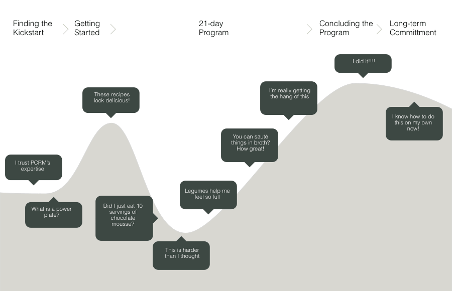
I created a journey map to outline the ideal experience for our users. They would begin using the app as novices: new to cooking plant-based foods and in need of the most guidance. By the end of the 21 days, they should have a firm grasp of basic recipes and ready to plan meals on their own.
An Intuitive Structure
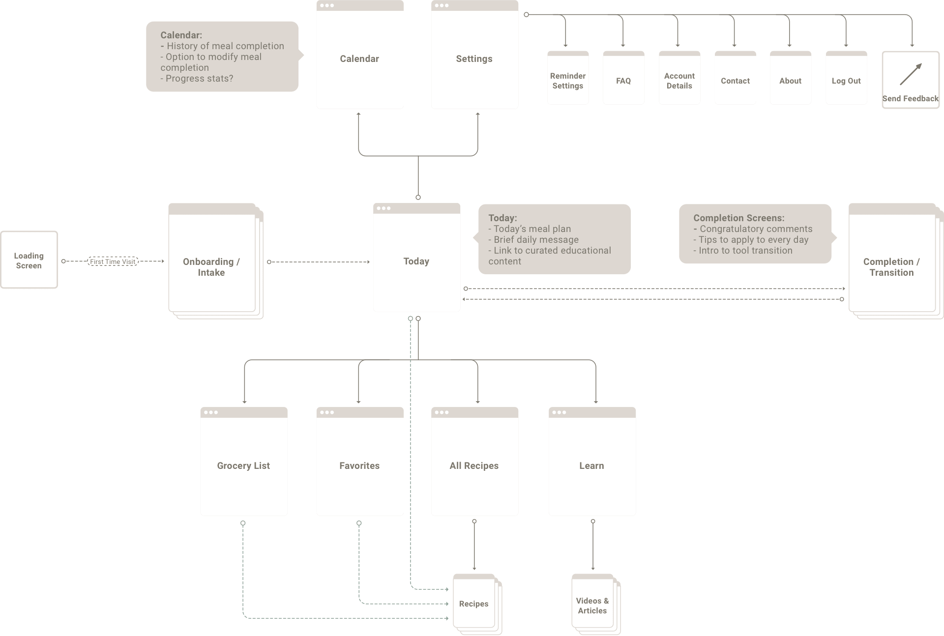
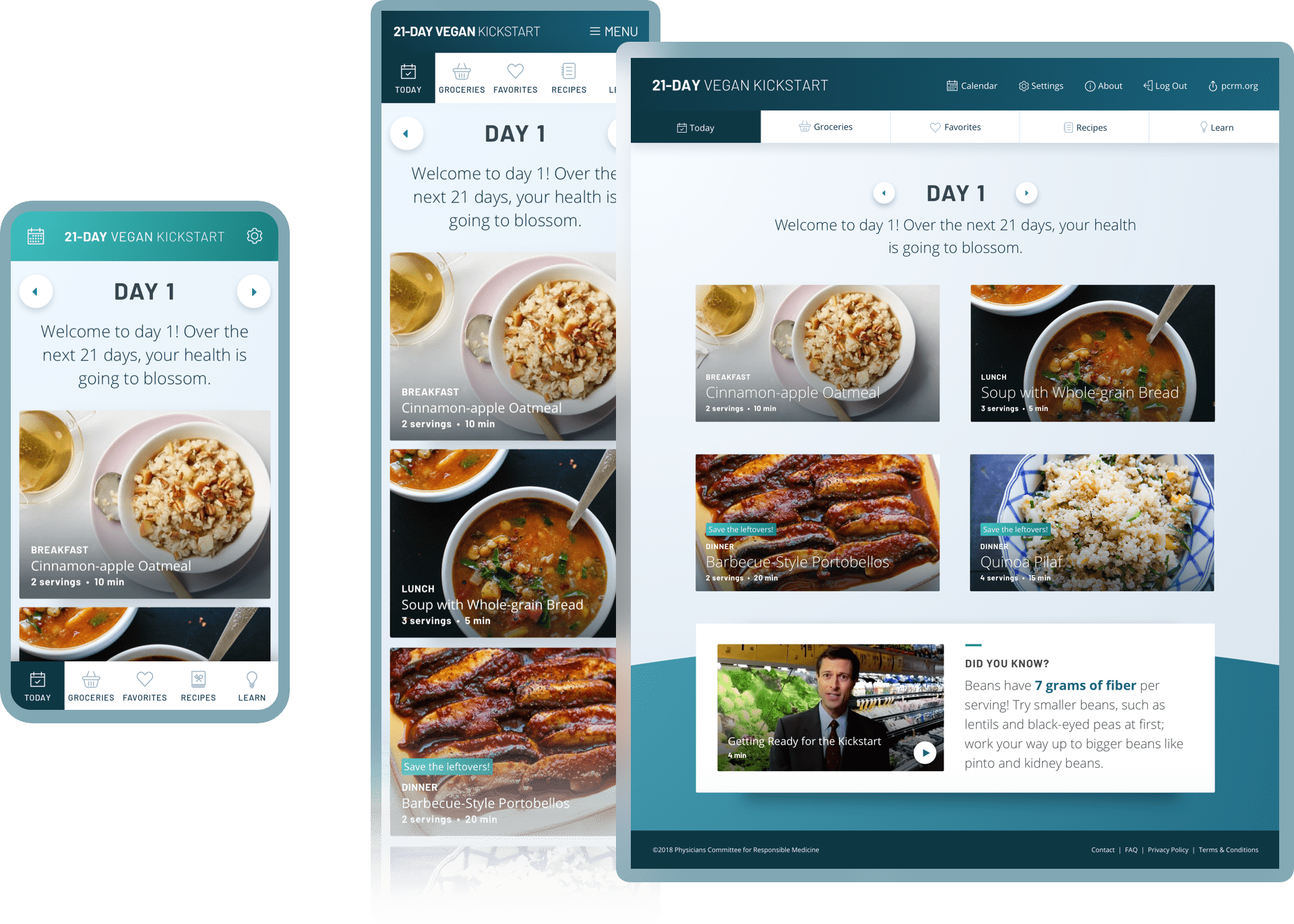
I organized the site to have a simple structure. The app loads to a “Today” screen that showed that day’s recipes and one relevant tip that linked to an educational video or article. I grouped content to mimic physical spaces. Users access settings and the calendar at the top of the screen. Users navigate horizontally to different areas of the site through the section tabs at the bottom.
Defining the Content
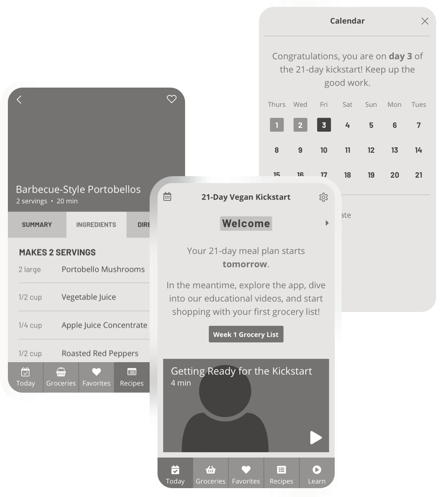
Because most users would be accessing the Kickstart program on their mobile phone, we needed to use small space judiciously. We reduced the amount of information on the today screen so that users could view it all in a quick moment. For users that had more time, we grouped all other exploratory content into clear sections: a grocery list that users can check off at the store, a searchable recipe library, and a hub for all of the educational video content in one place.
Bringing the App to Life
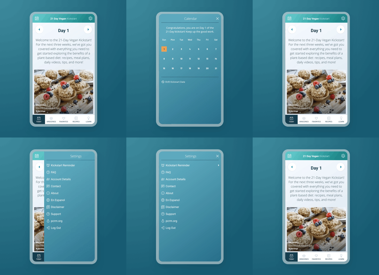
I modified the design aesthetic of the app’s creator, Physicians Committee for Responsible Medicine, just enough so that the properties were clearly related, but the application felt like it’s own experience. I prioritized incorporating bright blue tones, which would accent the rich warm hues in the recipe photography. The aesthetic is fresh and clean, and lets the photography and video content come forward.
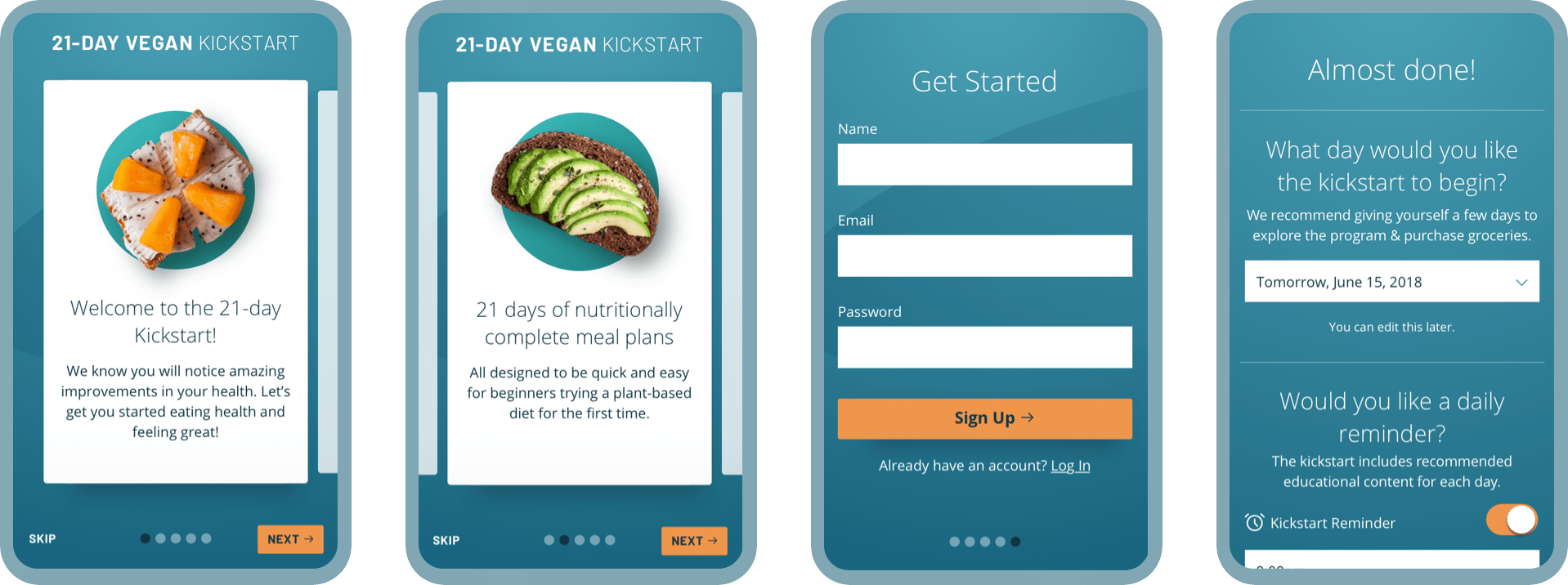
Smooth Onboarding
The app introduces the user to the basics and signs them up for the Kickstart quickly.
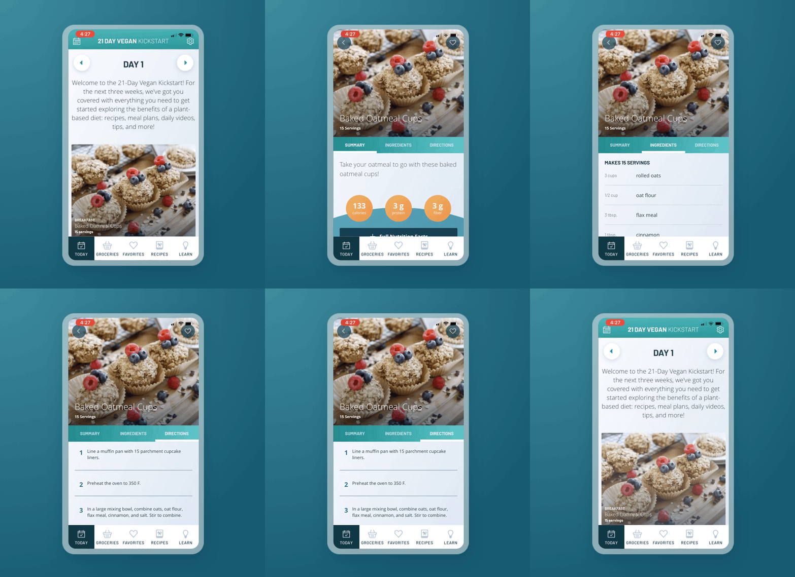
Starting With Today
Users can explore the day’s recipes and learn a daily tip.
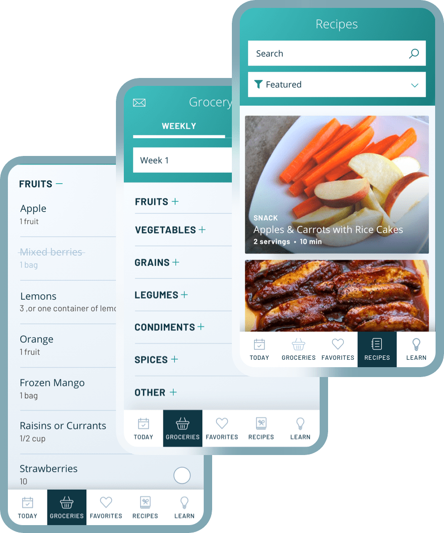
Grocery Lists & Recipe Library
Users can view groceries for the week or by recipe. Ingredients can be checked off while users shop at the store.
The app includes an extensive collection of recipes that can be searched by ingredient, filtered, and favorited.
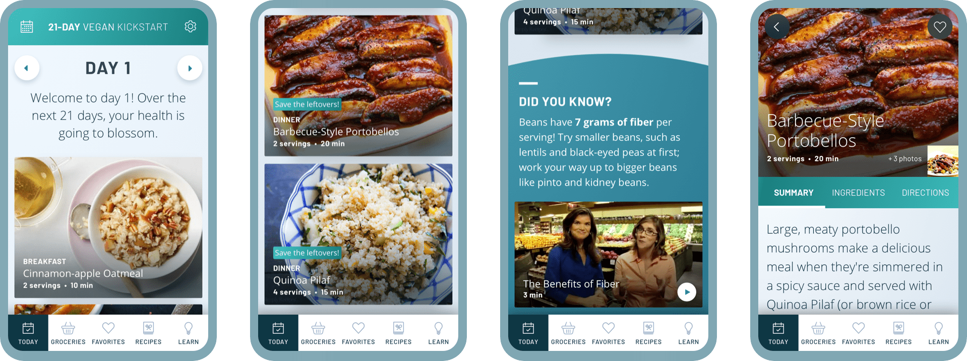
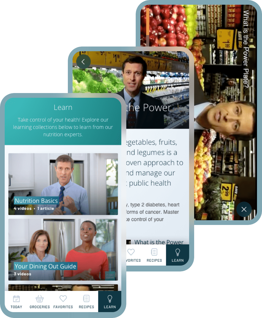
Nutrition Tips & Tricks
A cooking tip and video are included each day, but users can explore all of the educational content in one place in the Learn tab.
Accessible From Anywhere
Users can download the app on their phone, or access the 21-Day Vegan Kickstart in the browser on their computer. Their progress and settings are saved with their account login, so changes in one place will stay up to date everywhere.
You can view the live app and website here.
About the Project
CLIENT
Physician’s Committee for Responsible Medicine
Project Team
This project was created during my time at Threespot.
Research, Strategy, UX Design, IA, Wireframes, UI Design—Meryl Pritchett
Creative Direction—Sid Barcelona
Development—Daniel Boggs & Mat Brady
Project Management—Lizzy Cederberg