Physicians Committee for Responsible Medicine
- Research
- Strategy
- UX Design
- IA
- Wireframes
- UI Design
A website redesign to transform a vast, complex network of pages into a clean, fresh, & modern digital experience.
PCRM’s website was extensive, complicated, and outdated. The redesign clarified the messy structure and unified and updated the visual brand. This is related to an app redesign for the same organization.
Restructuring a Complex Network
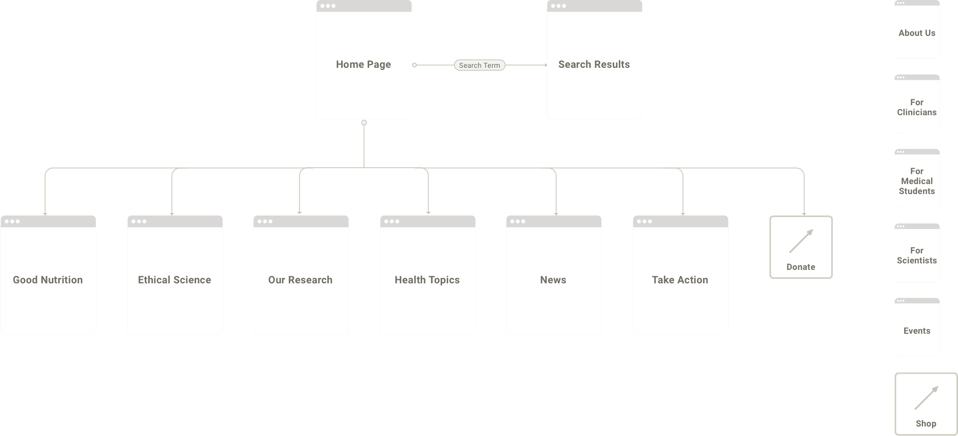
PCRM’s website had an extensive wealth of valuable content for audiences including clinicians, medical students, researchers, and the general public. They also provided expertise on nutrition from 2 distinct perspectives: the data-driven health benefits of a plant-based diet, and the positive impacts of ethical science practices.
User-centric Organization
PCRM’s previous structure had become complex and convoluted over years of updates and needed reorganizing. I grouped the content by topics that the users would be familiar with for easy exploring. Rather than trying to serve all audiences everywhere, more general information is provided at top-level pages, and users can drill down to expert-focused content. Because the main audiences could easily self-identify, we also included user-based navigation in the utility navigation and on the homepage.
A System of Flexible Storytelling Components
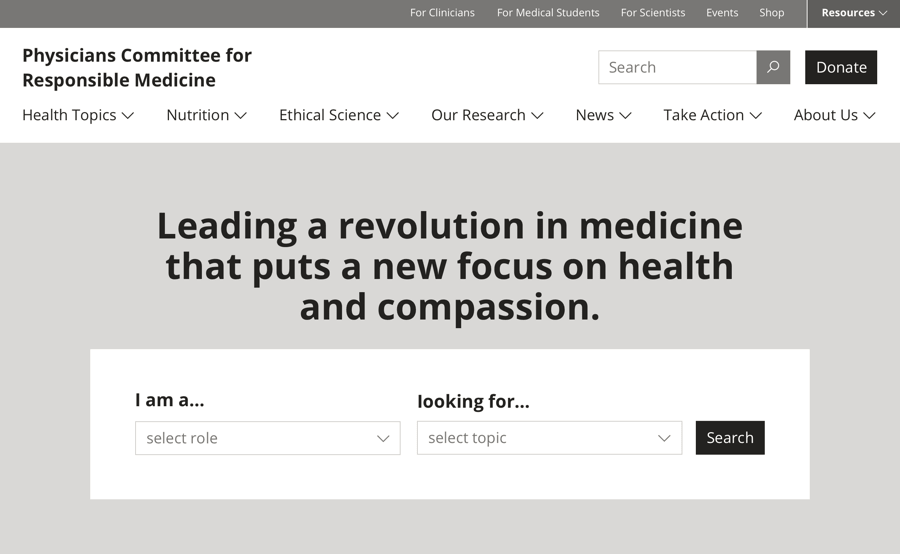
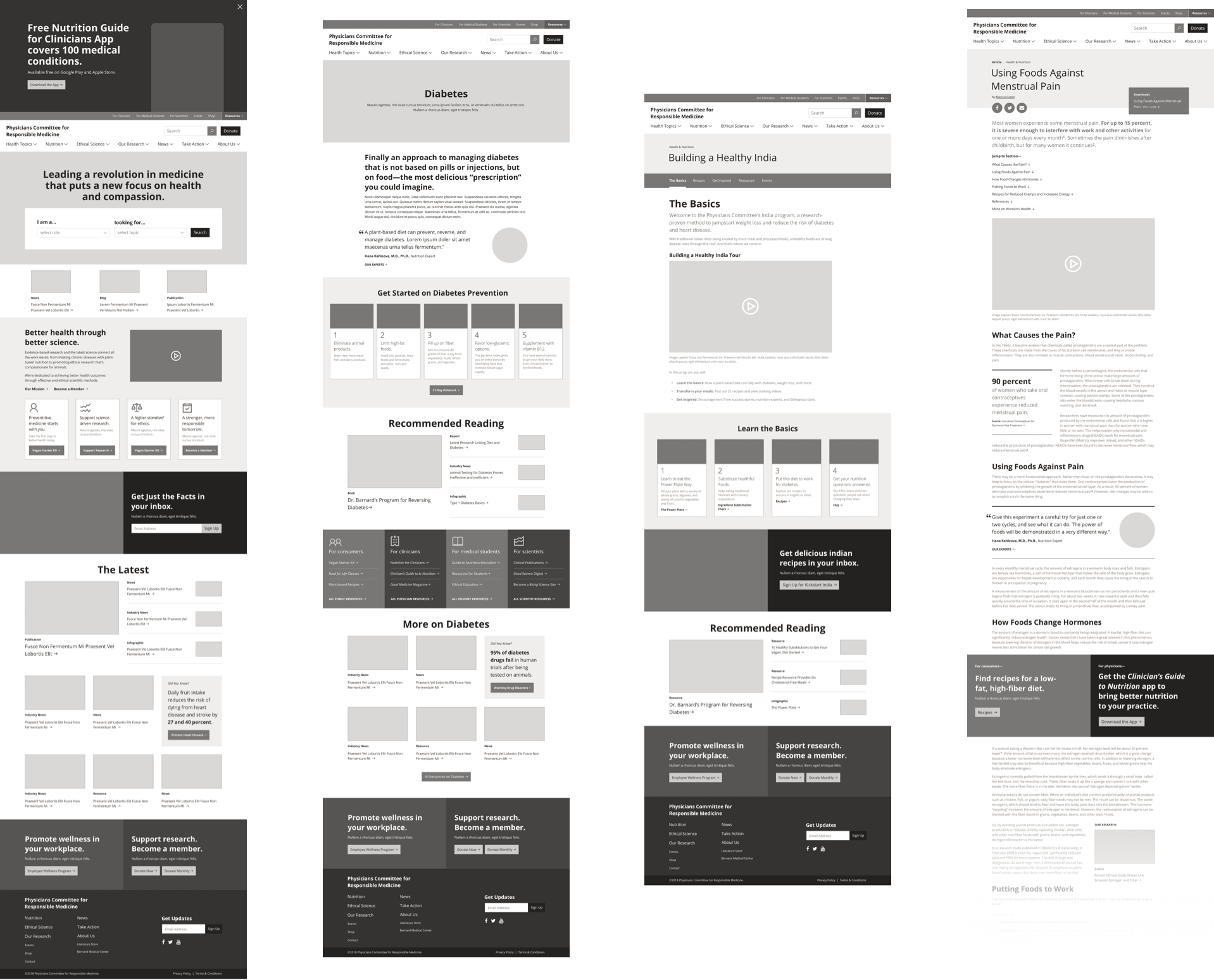
PCRM has many departments developing content for the website, so they needed a wide variety of components to tell all of their stories effectively. We developed templates for microsites to use for campaigns and collections. Article pages had promotional components that could target specific audience types.
Clean, Modern, Smart, & Fresh
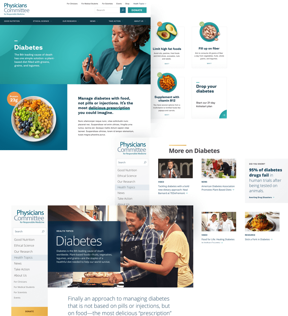
PCRM needed an aesthetic that was fresh and modern, with styles that complement appetizing food photography. The style also needed to showcase their research-driven expertise. Because PCRM had ample internal staff to take high-quality photography and video and edit digital assets, we had more freedom in design to create a system that relied on custom visual elements.
Another designer and I each developed design directions to push the different attributes of PCRM’s brand. Then we took the elements from each direction that were working best, and combined them into a cohesive design system.
Attractive Templates to Serve Diverse Audiences
The final style was professional and clean enough to promote credibility for PCRM’s expert audiences, and fresh and bright enough to appeal to the meal-plan focused public.
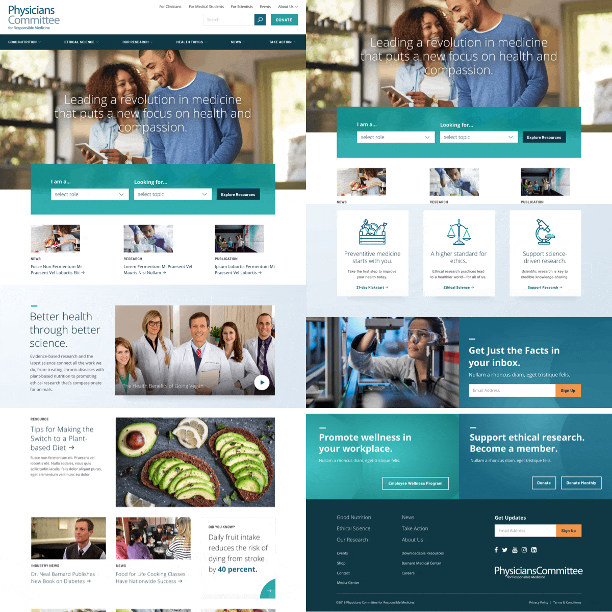
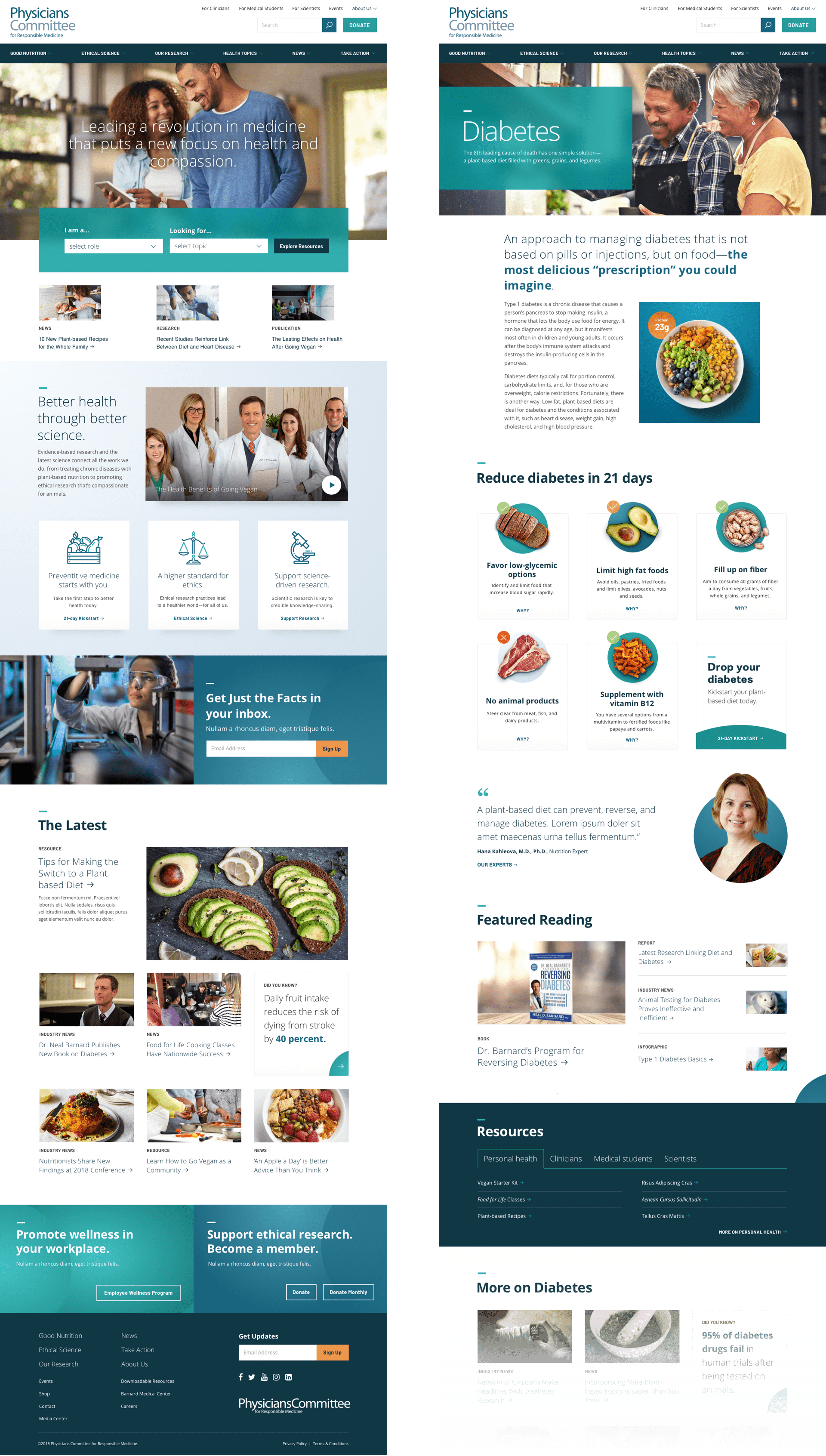
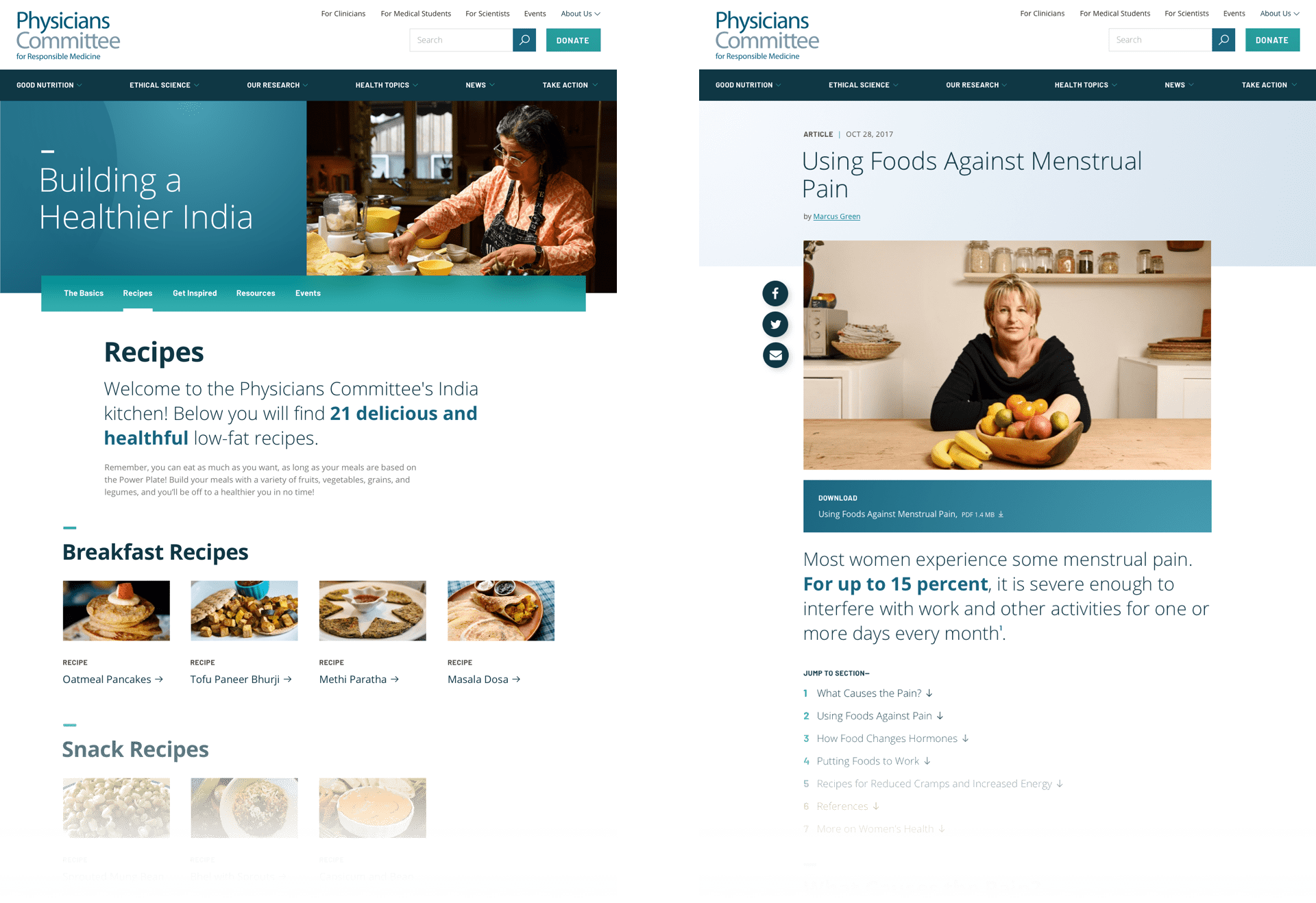
Storytelling components help introduce PCRM to new audiences:
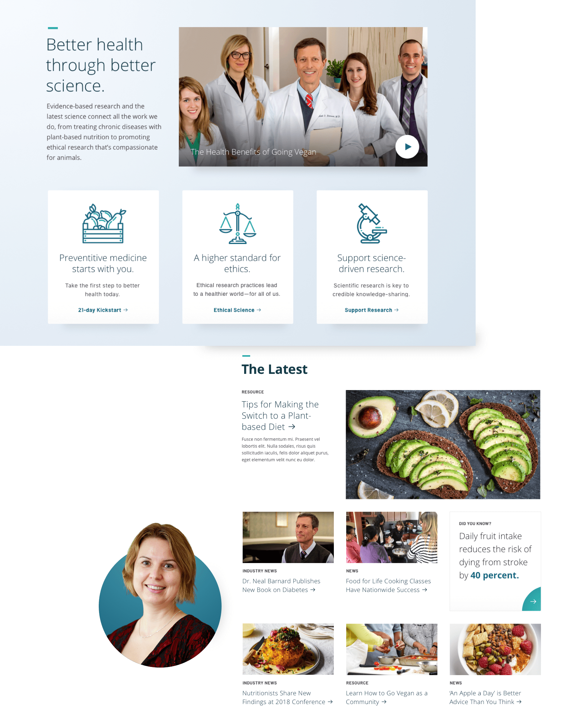
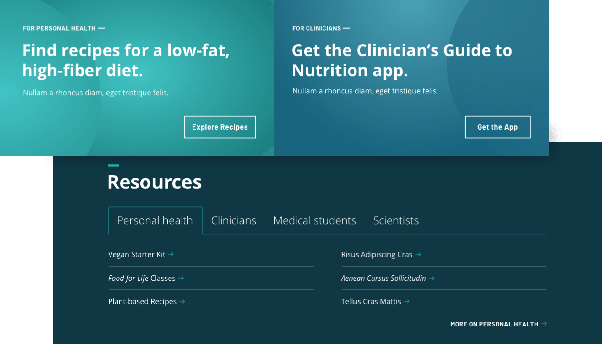
Promotional components allow PCRM to market to specific audiences based on where users are on the site:
You can view the live website here.
About the Project
Client
Physician’s Committee for Responsible Medicine
Project Team
This project was created during my time at Threespot.
Research, Strategy, UX Design, IA, Wireframes, UI Design—Meryl Pritchett
Creative Direction—Sid Barcelona & Christopher Montwill
Development—Daniel Boggs
Project Management—Lizzy Cederberg