The USO
- Strategy
- UX Design
- UI Design
- Campaigns
Website redesigns, fundraising campaigns, microsites, and more.
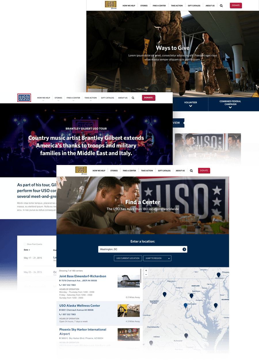
The USO was one of my first accounts during my time at Threespot, and I helped support their digital landscape for four years. It began with a website redesign in 2014, and I’ve since worked on site enhancements, fundraising campaigns, marketing materials for print and social media, and various other projects.
A Long-standing Relationship
I worked with the USO for four years, and the length of the commitment allowed me to become very familiar with their brand. I’ve supported quick projects like social media campaigns and longer-term efforts—like designing a flexible set of microsites for USO’s centers. I supported the evolution of USO’s digital brand though brainstorming marketing ideas, and regularly enhanced pages as new opportunities arose.
A Hero’s Journey
In efforts to bridge the growing gap between service members and America’s public, the USO sought to reveal the journey that service members face today. This is a wider goal that has manifested in many forms and campaigns, but a key contribution was the redesign of their homepage.
My team and I worked with the USO to develop a clear story the highlighted the impact of service members, and educated the public on the cycle they go through from enlistment, during service, and transitioning back home. I translated this into a visual and interactive homepage design. Animating and prototyping early was key in this process, and made it possible to move the redesign into development quickly.
Encouraging Gratitude
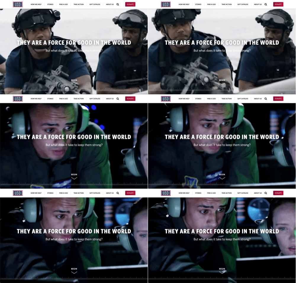
The homepage opens with a full-screen video showing the contributions service members provide every day.
An Interactive Journey
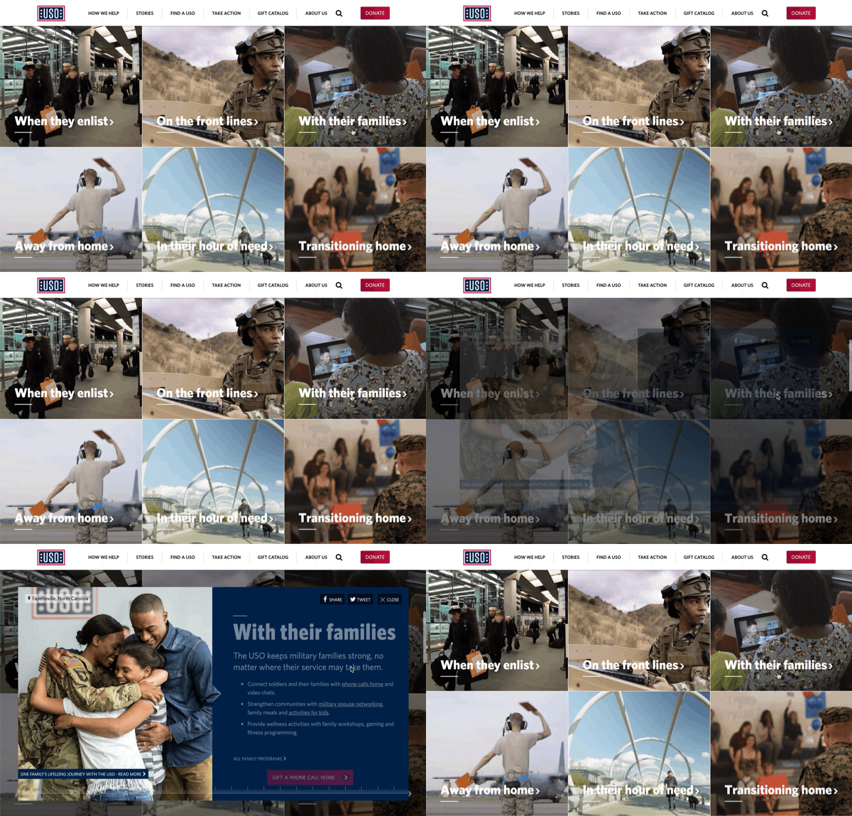
I wanted the journey of the service members to be the most interactive and engaging portion of the page. Images of service members connect with each stage of the journey. When a user hovers over a phase, the image transitions into a corresponding video: showing a glimpse of the moment.
Each phase expands to give details about the service and tie to articles to read more about individuals. Each phase also provides opportunities to give back through donations or messages of support.
Global Impact
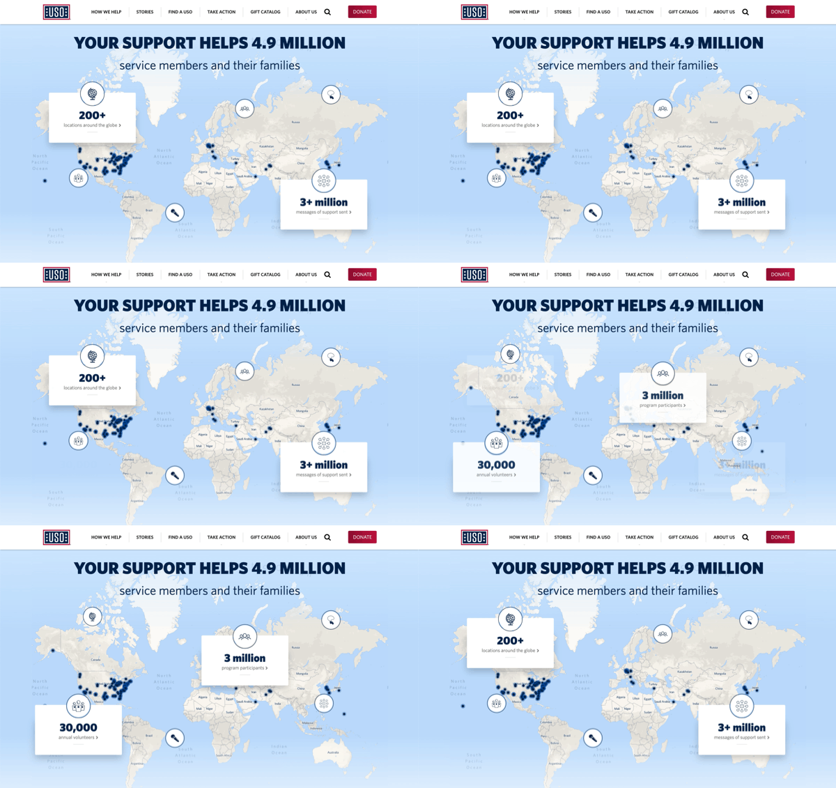
A map highlights all of the USO’s centers around the globe. This interactive area presents stats of impact. Users can click through the different icons to find more stats, and read further about each one.
Project Team
UX, Design, and Animations—Meryl Pritchett
Creative Direction & UX—Christopher Montwill
Project Manager—Jack Nank
A Network of USO Centers
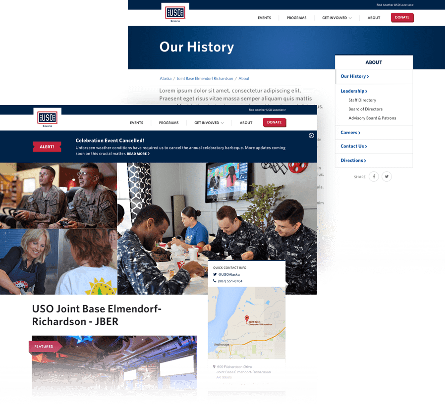
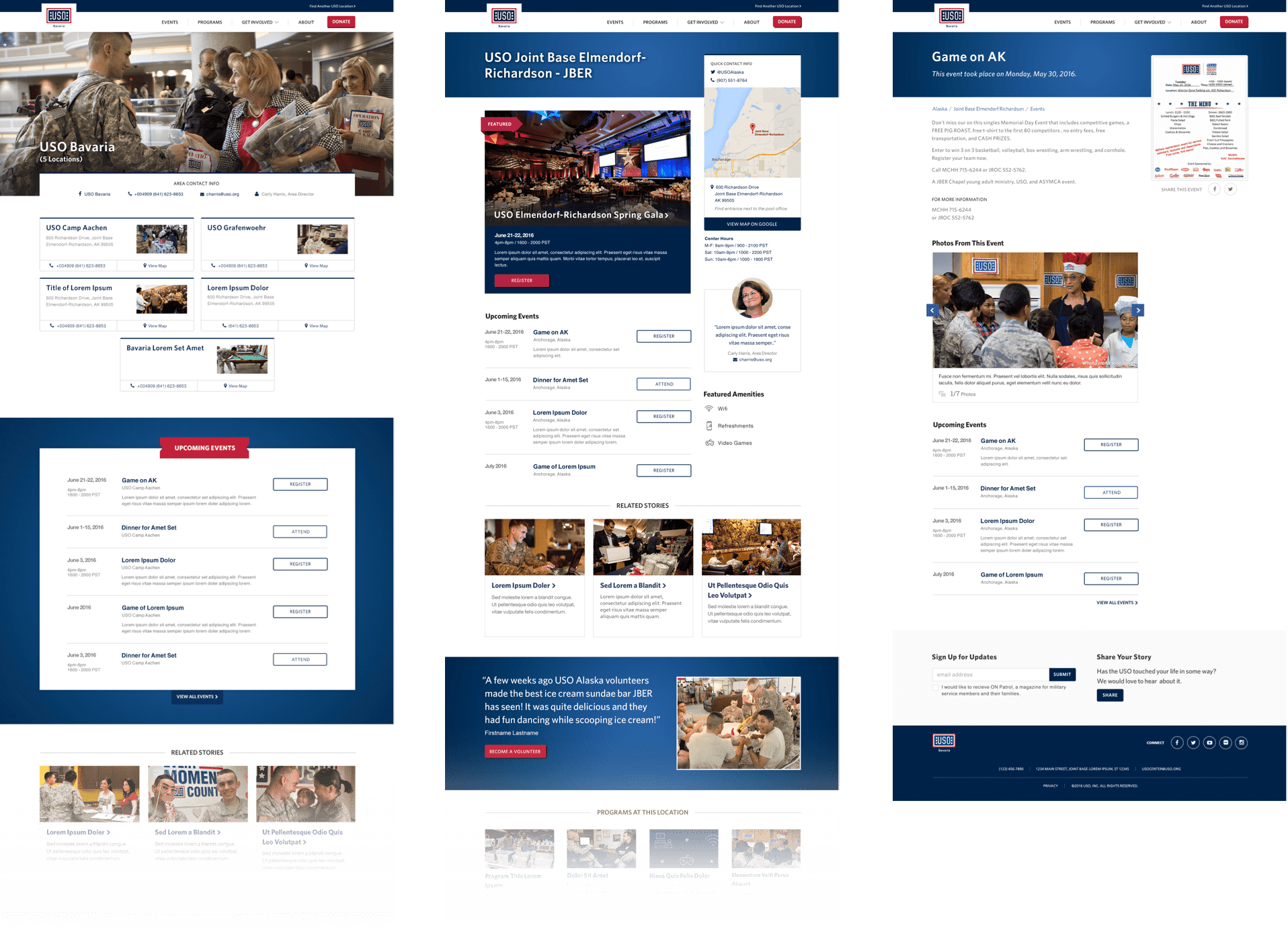
The USO has over 200+ centers around the world. These centers provide comfort, events, and entertainment for service members. The USO was in need of a digital presence for these centers so that service members could easily find centers where they would be deployed. They can learn about the amenities available at each center in advance and can read stories and find important information before they arrive.
The centers had a wide variety of needs, and it was important to make sure that each center’s site was flexible enough for the staff to build out the site to suit their individual center. We included a wide variety of sections and components so centers could use what they needed, and built in flexibility so that unnecessary information could be omitted.
Project Team
User Interface Design—Meryl Pritchett
Creative Direction—Christopher Montwill
User Experience—Cydney Luong
Project Manager—Jack Nank
A 75 Year Legacy
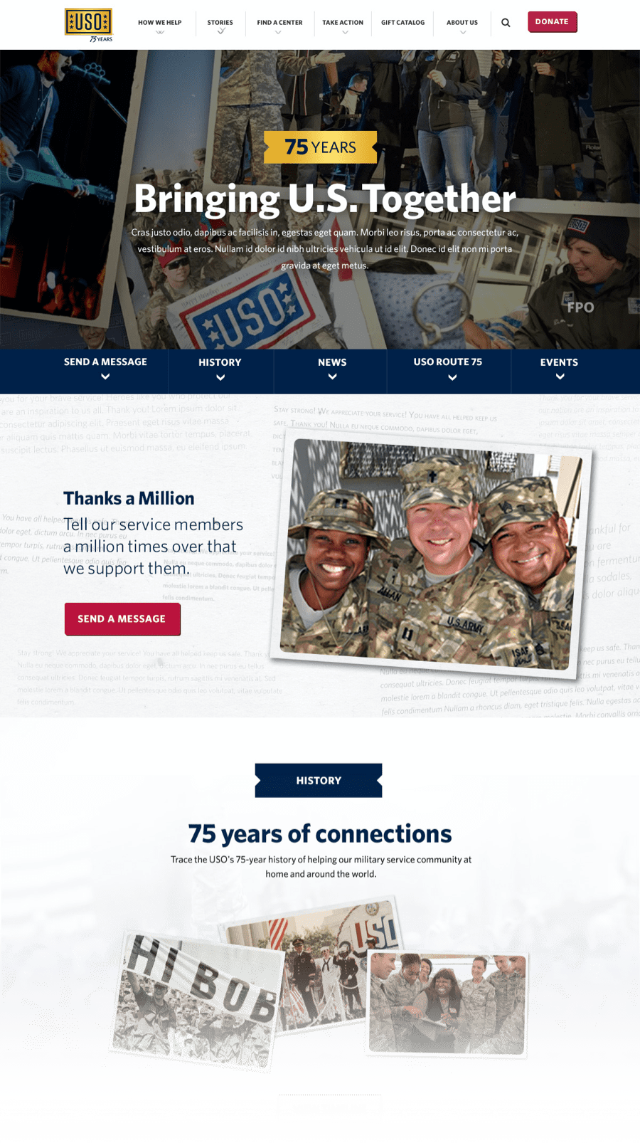
The 75th anniversary was an important milestone for the USO, and was an excellent opportunity to share the impact they’ve made in their history with the public. We redesigned the USO’s homepage for the year of their anniversary: it focused on highlighting the emotional impacts of their work and rekindling the connection between service members and the public.
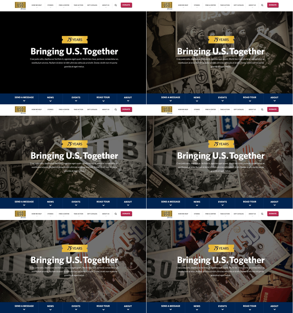
This included a nostalgic animation of photos from the USO’s history, spanning key moments from the past to the present.
The homepage design thanked visitors for their support and prompted them to send messages of gratitude to service members. 1,455,017 messages were collected through the homepage design and supporting digital campaigns over the course of the year. These messages were sent to USO centers around the world to lift their spirits, and were used in future campaigns.

Project Team
Motion Graphics & UI Design—Meryl Pritchett
Creative Direction, UX Design, and UI Design—Christopher Montwill
Project Manager—Jack Nank