NAFSA: Association of International Educators
- Agile Process
- Research
- UX Design
- UI Design
- Design Testing
A tool that helps International Education specialists assess their professional competency
NAFSA: Association of International Educators is a non-profit professional organization for professionals in all areas of international education including education abroad advising and administration. They aimed to create a tool to help those professionals assess their competency both individually and across teams. The tool measures against three domains to identify team strengths and gaps—and then recommends resources to address them.
An Agile Process
We had to define and build a new tool that resonated with NAFSA’s users—all before a quick deadline driven by a conference that would promote the tool. In order to launch on time and prioritize core features for the MVP, we planned a 10-week sprint-based process to research, define, design, develop, and test the product.
Starting With the User
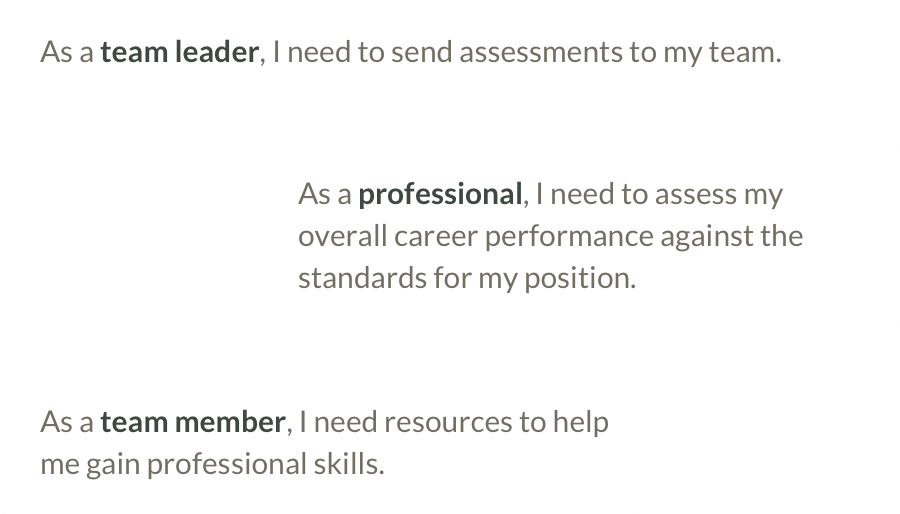
We began by reviewing the research on the material and the users that NAFSA provided and developed user stories for every need that the tool could address. I developed high-level user flows and sketches to get a rough idea of the general structure of the tool, while our creative director created design moodboards to develop an overall aesthetic. Then we prioritized the user stories and hypothesized how they might fit into our 5 sprints.
Five 2-week Sprints
Each sprint began with a team meeting to plan out how we would address that sprint’s collection of user stories. I would sketch quick user flows and wireframes of our intended functionality, which the developer would use to begin building the structure. Meanwhile, I would create high-fidelity mockups to finesse the design of new UI elements. We’d regroup daily to review the team’s progress until we had a fully developed, functioning, and responsive tool.
At the end of the sprint, we would share out progress with the client. We reviewed the product as a group, determined if any aspects needed revisions, and prioritized the remaining user stories for the next sprint based on our progress.

Testing With Real Users
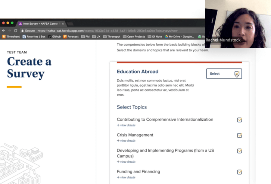
After 3 sprints, we had enough of the tool in place to begin effectively testing with users. I led a series of usability tests over video screen share where we asked users to complete tasks. We observed which aspects were the most successful and where users had trouble. The audience also provided feedback on what remaining features were most important to them.
Based on our findings, we identified important revisions to improve wayfinding, clarified the purpose of key elements, and identified long-term opportunities for the tool. We incorporated these improvements into our work for the remaining 2 sprints.
Evaluate Yourself or a Team
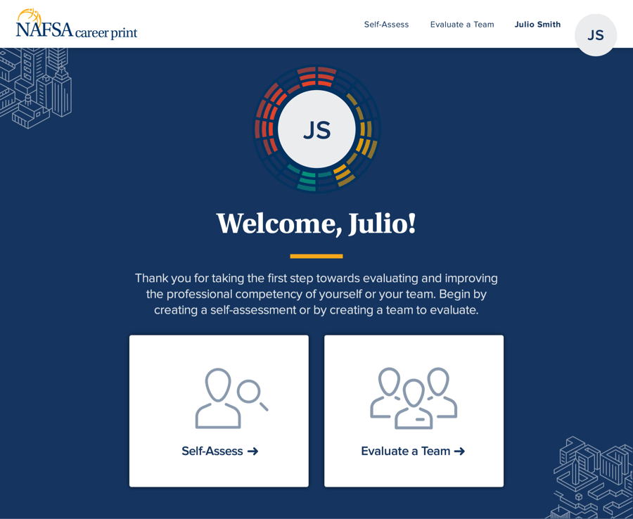
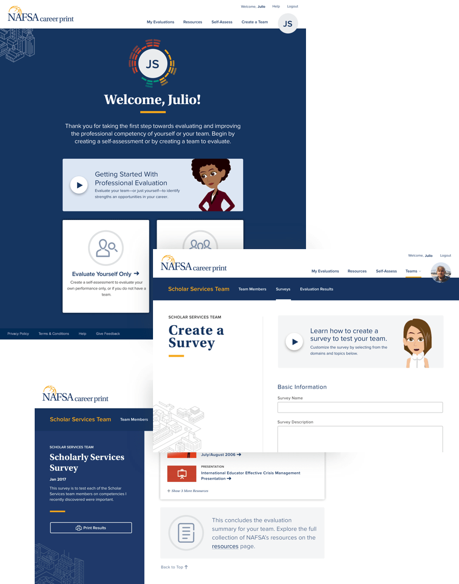
Once logged in, users can choose to evaluate themselves individually for professional development purposes, or create and evaluate a team to assess strengths and gaps among a group’s collective skills.
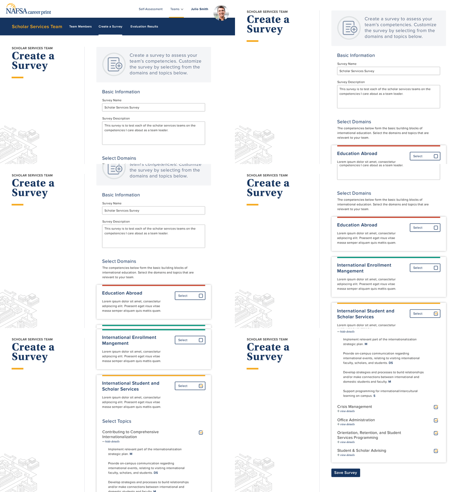
Creating an Assessment
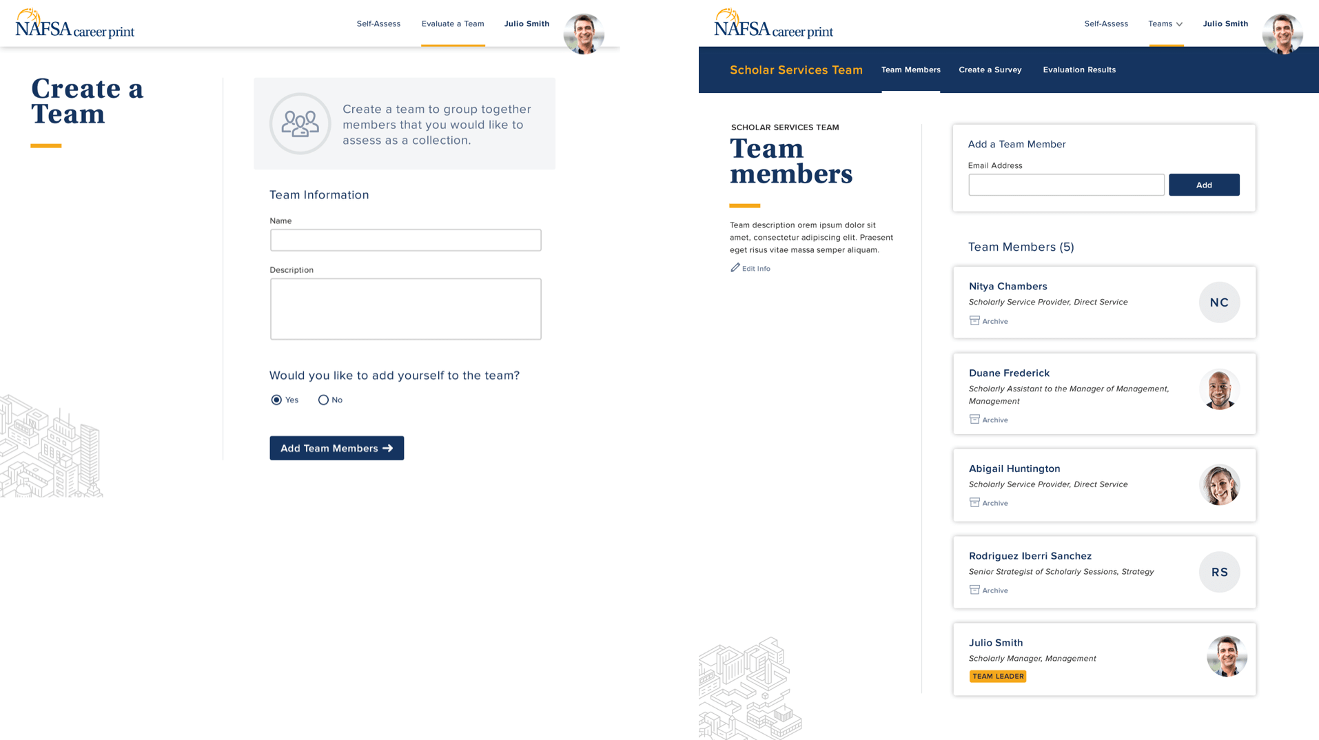
Team leaders create an assessment by selecting domains that are relevant to their teams’ work, and the skills they wish to audit against. Once it’s created, they send this assessment to each team member to complete.
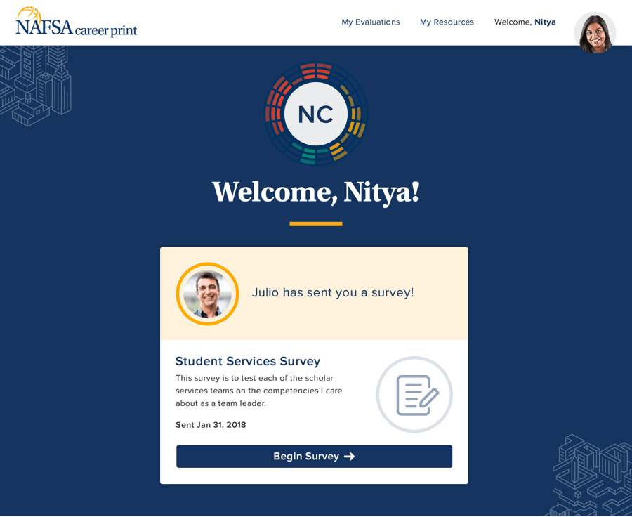
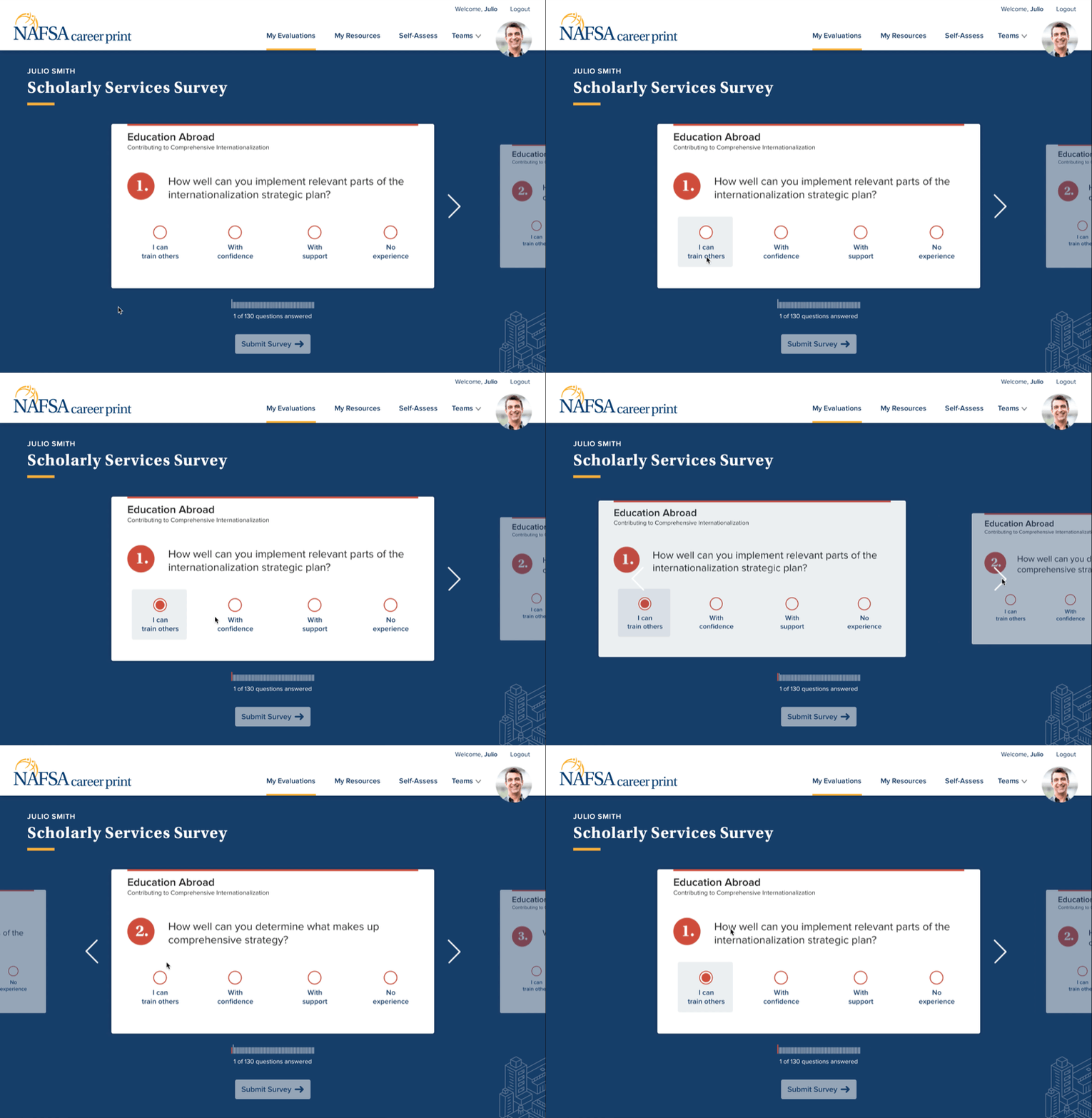
Taking an Assessment
Team members take a quiz generated by the team member’s topic selections, answering multiple-choice and write-in answers.
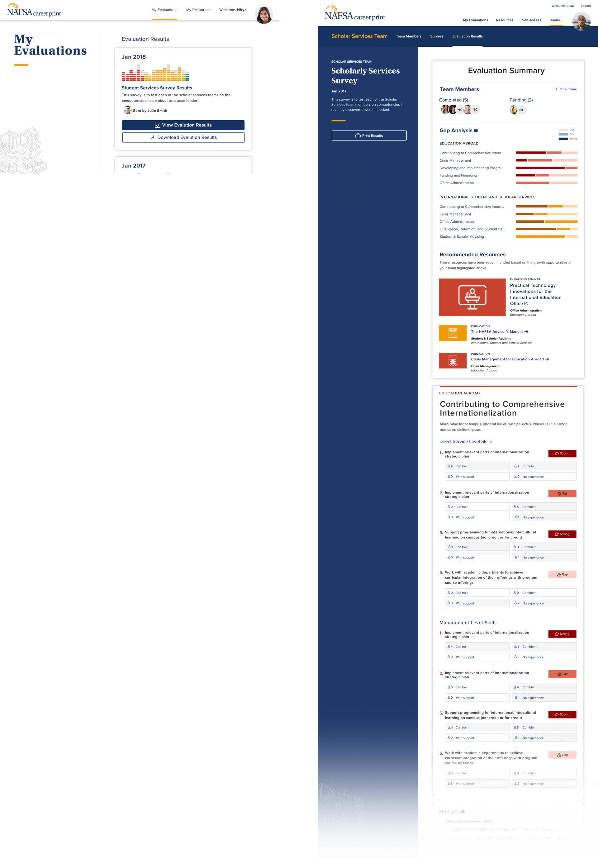
Evaluating the Results
Once results are in, the tool uses NAFSA’s competency logic to identify the biggest strengths of the team and the most significant gaps. This generates individual and team reports. Each team member receives recommended resources based on their individual opportunities for improvement.
Resources for Professionals
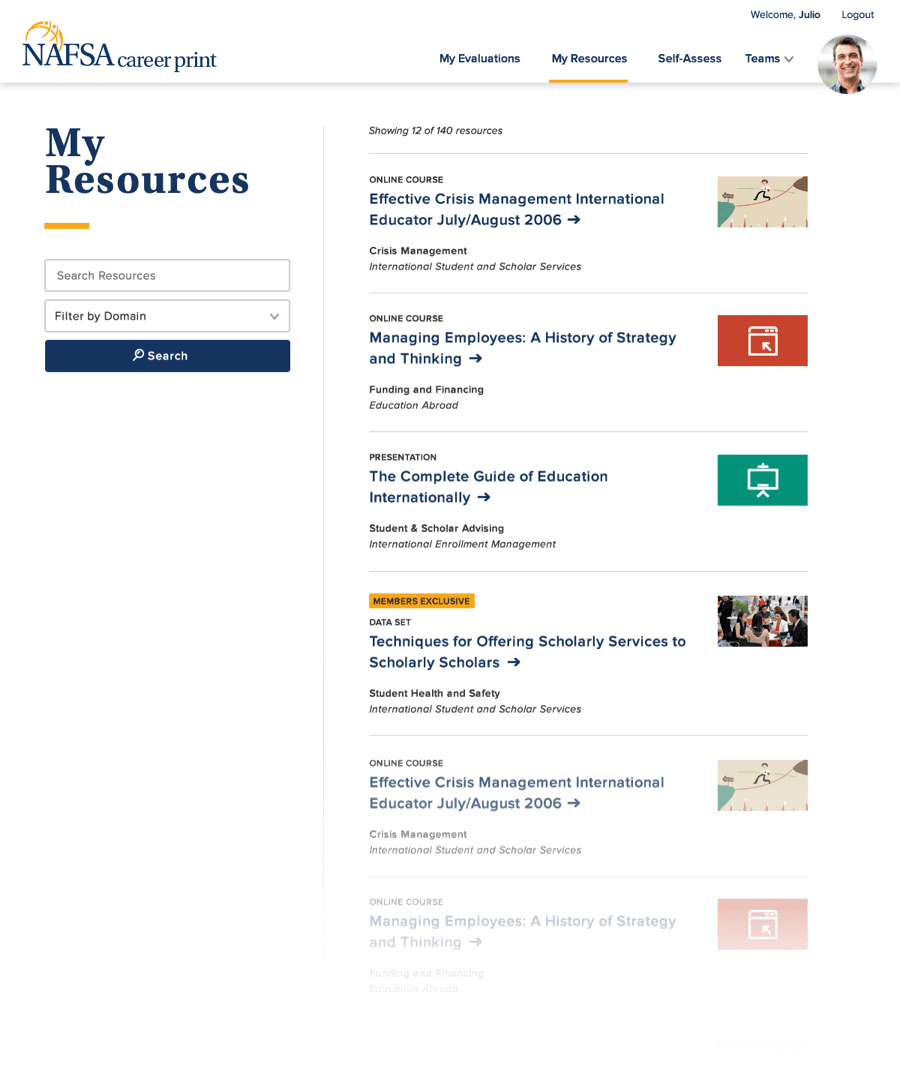
Team leaders and team members can access NAFSA’s full collection of educational resources, in addition to the curated resources that were recommended for them. These resources can be searched, sorted, and filtered.
Incremental Enhancements
After the MVP was complete, we launched the product to be used in the real world. After the tool had been in use by actual users for months, we took findings from the actual customers to define new improvements for the site. This included adding onboarding content and instructional videos and allowing flexibility for use cases we didn’t foresee in the initial effort. The tool is live and is still being improved incrementally.
You can view the NAFSA Career Print here.
About the Project
This project was created during my time at Threespot.
Client
NAFSA: Association of International Educators
Project Team
Research, UX Design, UI Design, Design Testing—Meryl Pritchett
Development & Technology Strategy—Daniel Boggs
Project Management—Lizzy Cederberg
Business Analysis—Elizabeth Barth
Creative Direction—Christopher Montwill