Future of Tech
- Research
- UX Design
- Usability Testing
- Content Development
An educational hub for discovering the fundamentals of emerging technologies
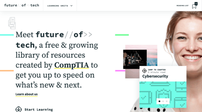
CompTIA came to us with a challenge: to create a tool that would engage and educate audiences about emerging technology topics like cybersecurity and artificial intelligence. This tool would enable students to explore careers in technology and enable professionals to utilize emerging technologies in business and make informed decisions about their use. This website was selected as a 2020 Webby Award Honoree.
A Recipe for Success
CompTIA was a dream client: they had lofty goals for an engaging product, and the faith to give us the creative reign to ideate without limits. Our only collective boundaries were making sure the tool was successful with it’s intended audiences, who we interviewed and tested with regularly.
Extensive Research
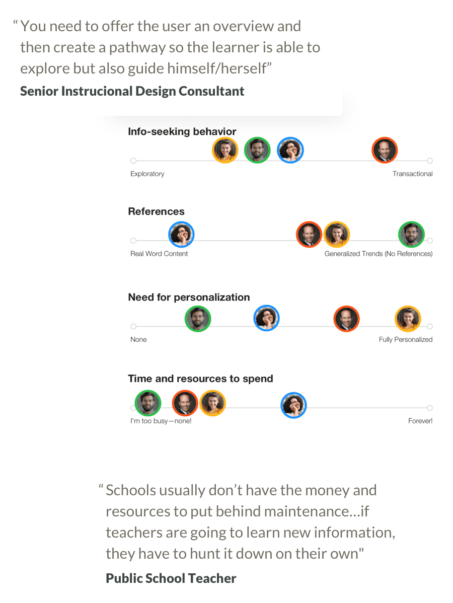
We began the process with extensive research: on audiences, in the subject matter, and on the landscape. I interviewed experts in instructional design to learn best practices to adopt and opportunities to take when creating digital tools. I interviewed members of our target audiences to learn what they knew already about emerging technologies, how they consumed content, and how and when they found time to learn in their busy schedules.
Optimizing for Four Audiences
In our initial rendition of the Future of Tech site, we had four primary audiences: executives who needed the fundamentals to make informed business decisions, tech salespersons who needed deeper knowledge for career advancement, young adults who may consider changing careers into the tech industry, and high school and college teachers who could use the information as subject matter in the classroom.
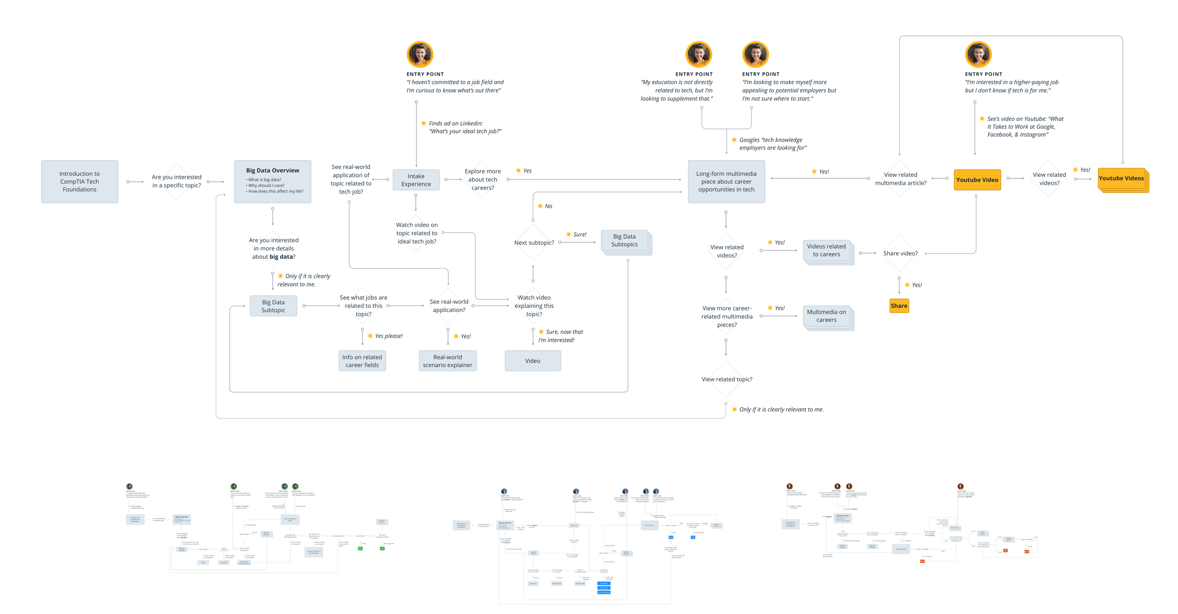
Each of these audiences needed the information at different depths and consumed content in different formats. They had different amounts of time and used different devices and platforms. I created extensive user flows to hypothesize exactly what types of content each audience would consume. Rather than trying to solve for every audience on every page, I used that hypothesis to map out which page types each audience was most likely to view—so that we could prioritize 1-2 audiences per page instead of 4.
Initial Definition
I developed quick wireframes to solidify the page types and determine which components and content would best serve the audience groups. We used these wireframes to translate the product into a live prototype quickly so we could test our assumptions with real users.
User-driven Aesthetic
I tested the multiple aesthetics for the site with members of our audience groups so we could learn what impression the design directions gave each audience, and which ones resonated best given our goals for the site. We used this testing to select an overall aesthetic direction for the site and made revisions based on the feedback we got from testers.
Testing Early and Often
We used our findings to build a fully-functioning prototype that would be shared with testers and internal audiences. We created content, interactives, and videos around 3 emerging technology topics. We used this prototype to test the content and functionality of the site with members from each of our audience groups. I proctored them through a series of tasks and allowed them to explore the site. This process highlighted gaps and opportunities to improve the product, like included more sources and educator resources like lesson plans. It also revealed which interactives and content types were the most popular so we could prioritize those on future topics.
Engaging, Interactive, & Evolving
The second evolution of the site integrated feedback from the user testing—taking opportunities to add more of what was working well, and solving for the common trouble areas. The client also shifted the priority of the audiences at this stage, so we put more focus on optimizing the content and interactives for teachers (and their teen and young adult students.
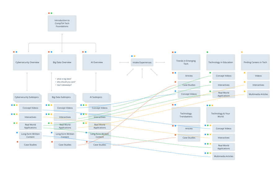
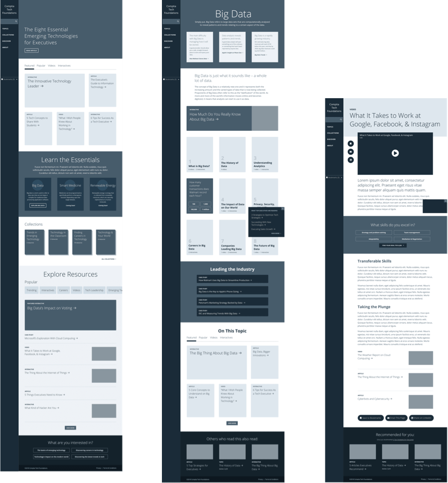
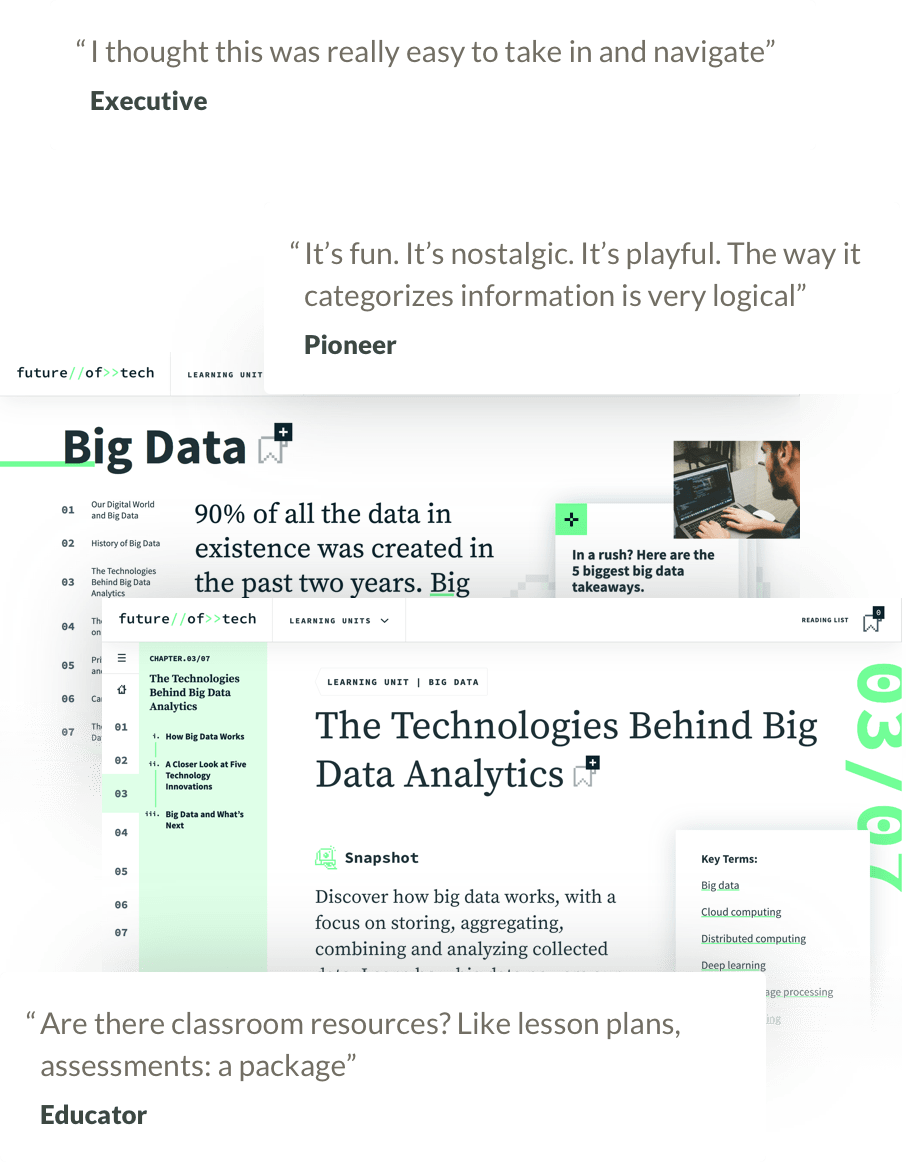
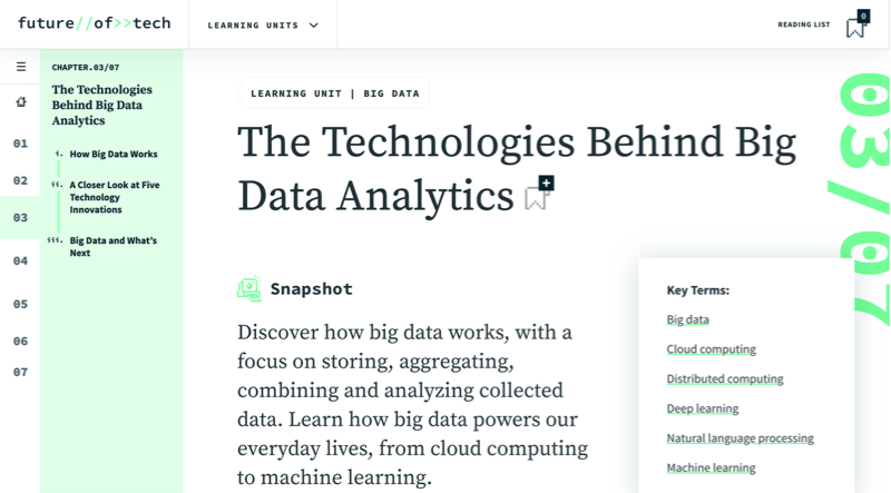
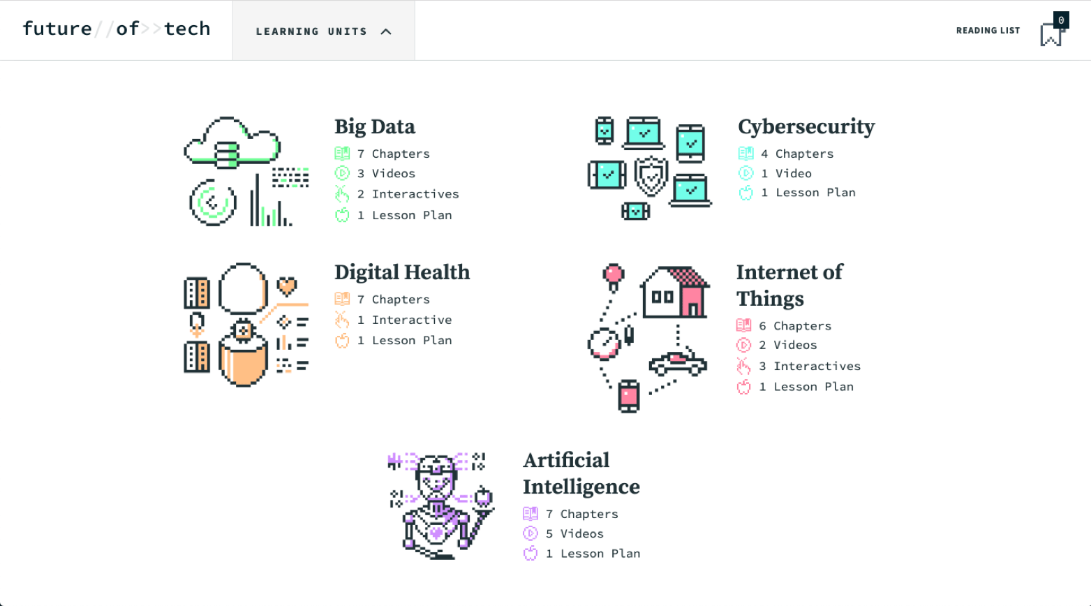
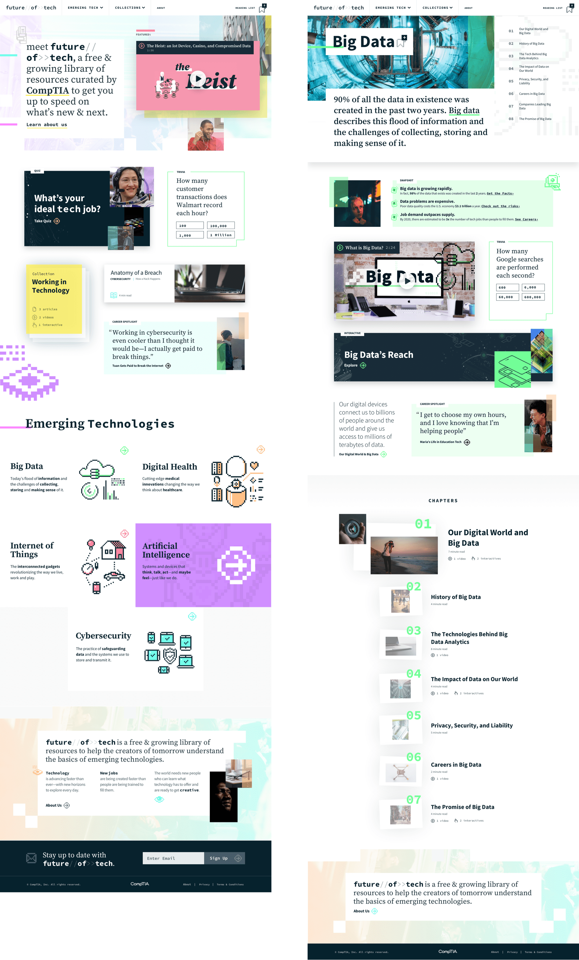
The site organized information around emerging technology subjects like Artificial Intelligence and Cybersecurity. Each topic had a landing page with the fundamentals, and long-form chaptered content to cover the details.
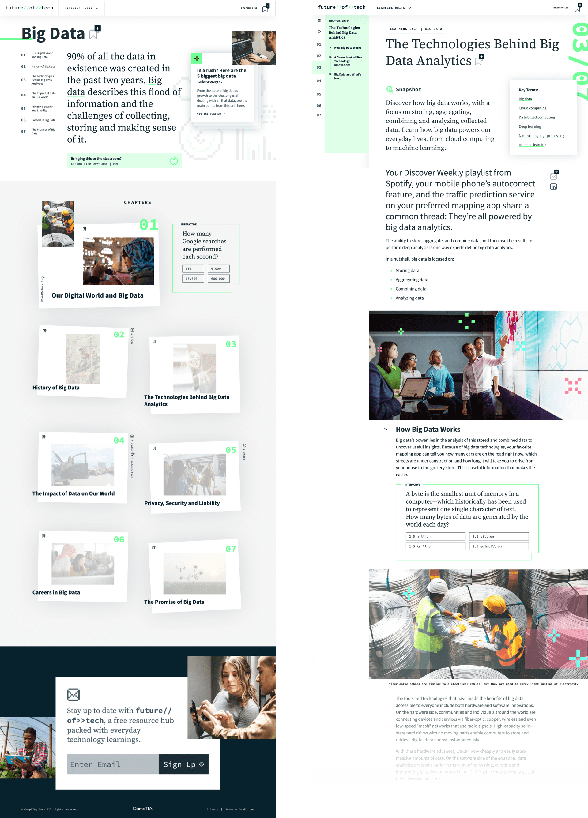
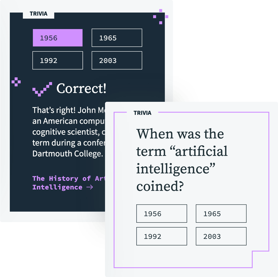
I wrote trivia questions related to each topic for users to test their knowledge. These questions were sprinkled throughout the content. After answering, the element would reveal the correct answer and link to a chapter related to the question.
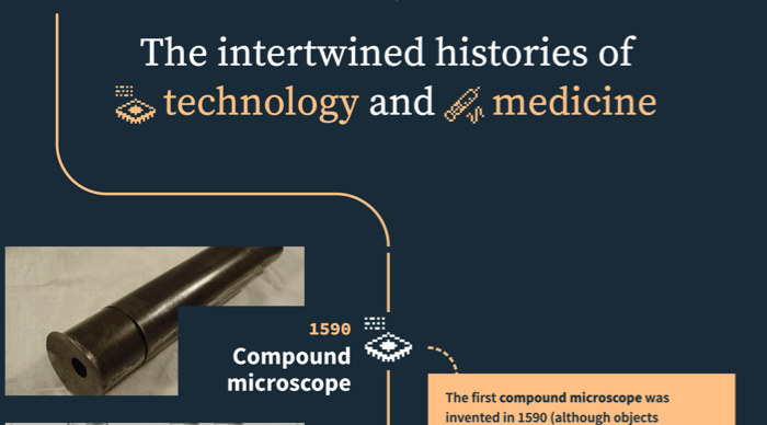
I conceived and developed the content for an interactive timeline to show how technological advancements led to medical advancements—and eventually led to smart medicine. Users could click through different items on the time like and see what events directly influenced each other.
We created a quiz-style interactive to guide users through scenarios to help them identify which technologies influence industries.
We developed videos to complement the written content. These videos are also available on Youtube and can be the entry point into the site for teens and young adults.
Testing, Testing, Testing
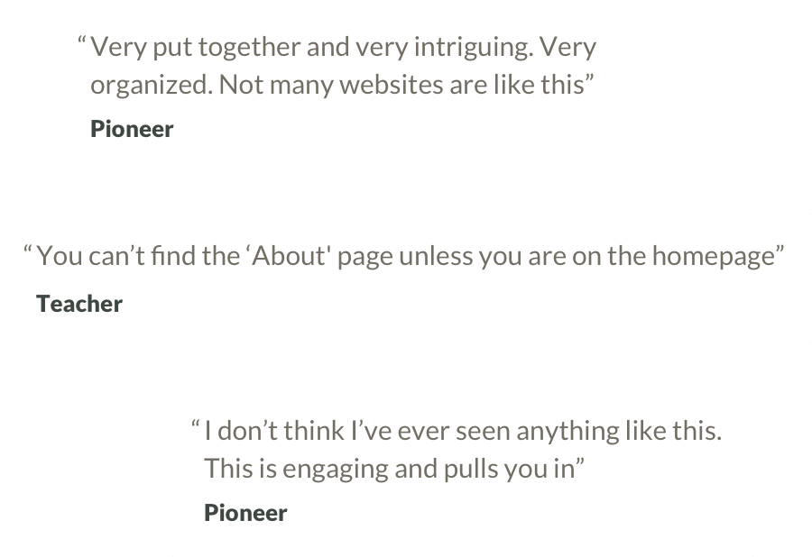
The new and improved version of the site was released to the public—but that didn’t mean we were done improving it. We tested the revised site with users again after we made all of our updates. Testing revealed that we had successfully solved almost all of the issues that had previously come up in testing. But we still found small adjustments to make, and testers had plenty of ideas for exciting future enhancements that we worked into our roadmap for the site.
Optimizing Pages for Students
I optimized the homepage with the new audience priorities in mind. Our research and indicated that our primary audiences would visit chapter content first, and then loop back to the homepage to discover why the site was created and where the information was coming from. I made sure that the homepage introduced the tool and linked clearly to an about page. I also used the page to highlight the different types of content on the site so users could comprehend the breadth.
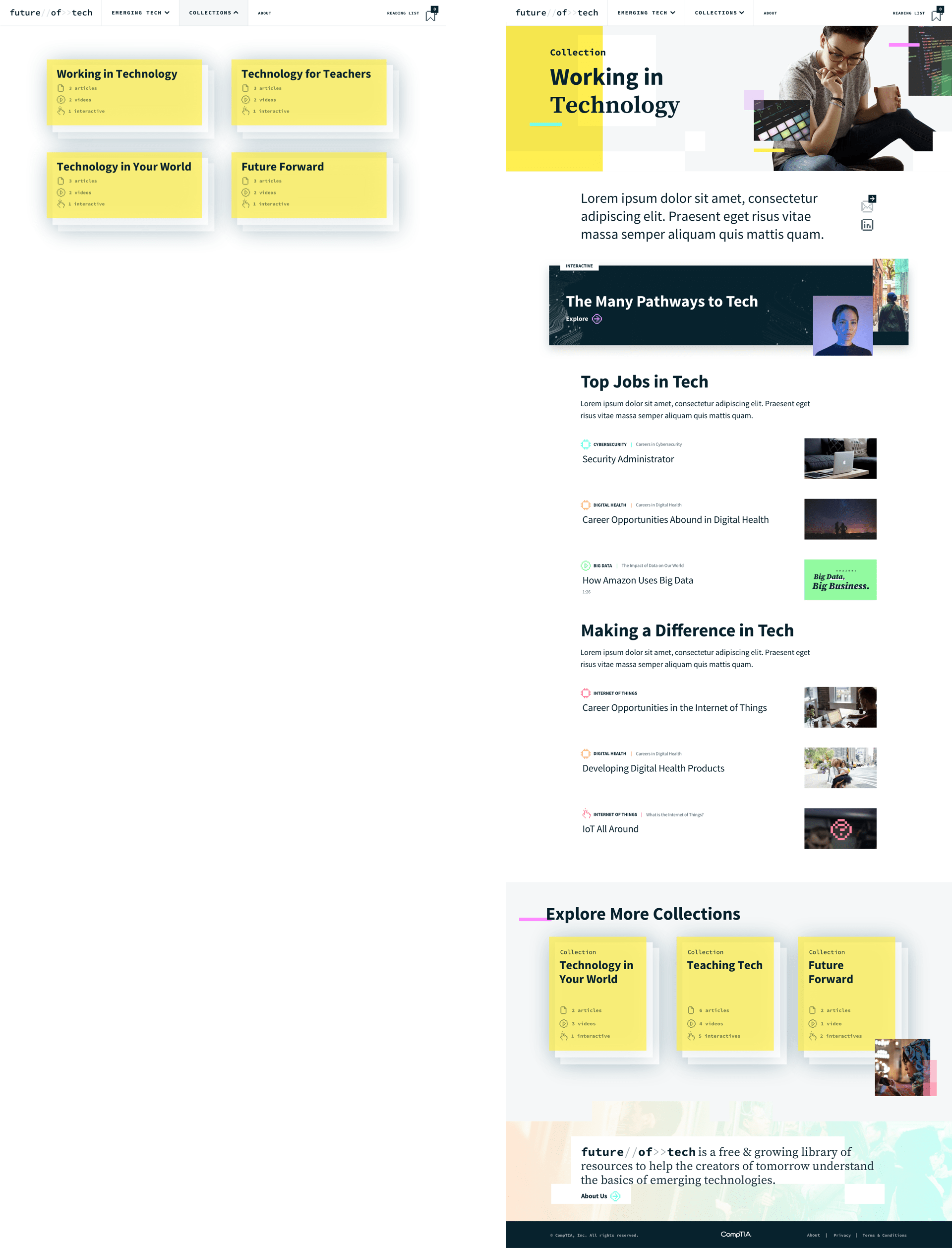
Creating Collections for New Exploration Methods
Based on the research and testing findings, I also included opportunities to explore the content by intention rather than just by topic area. I solved this with ‘Collections’ which grouped information based on what was important to our users. This included groupings like “Technology for Teachers” which compiled the best interactives to share in the classroom, and “Working in Tech” to provide articles on the different pathways into tech careers and career opportunities within the different subjects.
Constant Evolution
The site is regularly being tested with users and updated with new findings. You can view the latest version of the Future of Tech site here.
About the Project
This website was selected as a 2020 Webby Award honoree in the Website category for Education.
Client
Project Team
This project was created during my time at Threespot.
Research, Definition, UX Design, Usability Testing, and Content Development for Interactives—Meryl Pritchett
Visual Design, Motion Graphics, and Content Development for Videos—Spence Nelson
Creative Direction and Content Development—Elizabeth Barth
Research and Content Development—Michael Sanders
Development—Ted Whitehead
Project Management—Jack Nank