James Bell Associates
- Research
- Logo & Branding
- UX Design
- UI Design
A website redesign to present James Bell Associates as approachable and specialized partners to new and returning clients
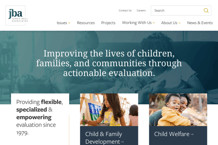
James Bell Associates (JBA) had a web presence that was outdated and didn’t represent the full picture of the organization. While existing partners were happy with their relationship, their site didn’t do much to demystify what JBA offered. JBA had vast collections of resources, but they were difficult for visitors to parse and use. The website redesign focused on reorganizing the site to serve the audiences that needed help the most, and updating the visual brand to represent JBA as the nimble, insightful, and practical partners that they were.
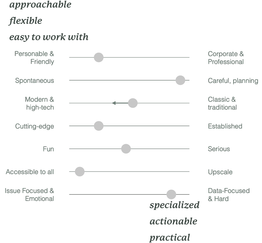
Focusing the Brand
During the research phase of the project, I worked with JBA to determine the largest gaps that they experienced with their current site and branding. Through a series of branding exercises, we identified where JBA stood currently and who they wanted to evolve into in the future. We identified what brand attributes JBA was already conveying well (data-focused, insightful) and what aspects they weren’t representing clearly (approachable, accessible, and flexible).
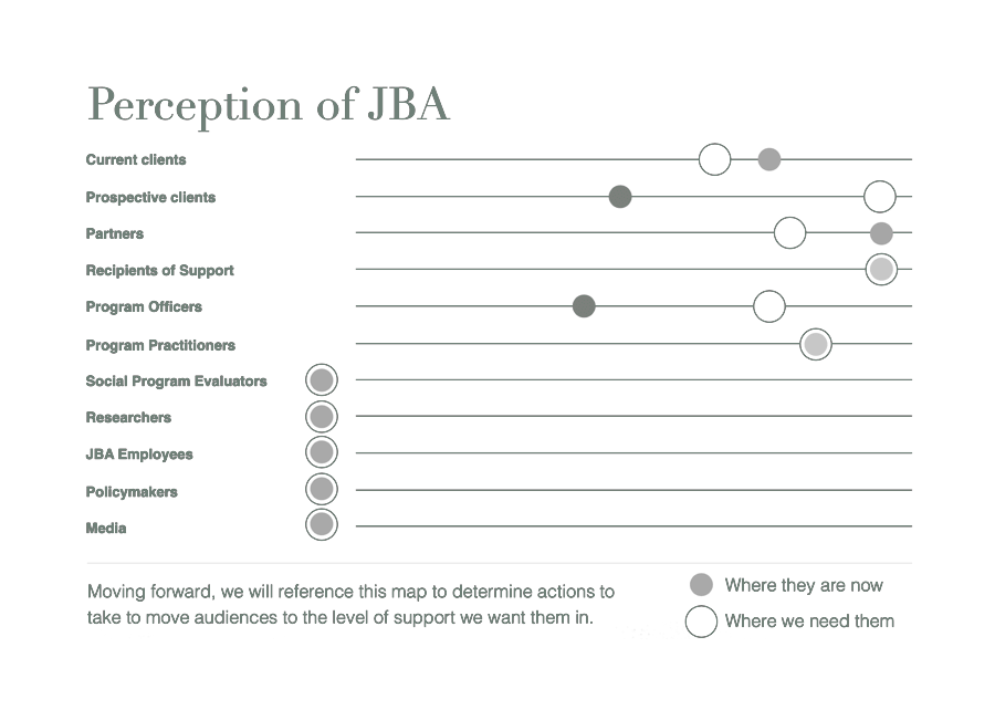
Prioritizing Audiences by Need
JBA had many important and diverse audiences that were difficult to prioritize. Rather than trying to force those audiences into a hierarchy, I focused on identifying which of the main audiences were already being served well, and which needed more attention. This helped us identify a smaller list of problems the redesign needed to address so we could focus our efforts effectively.
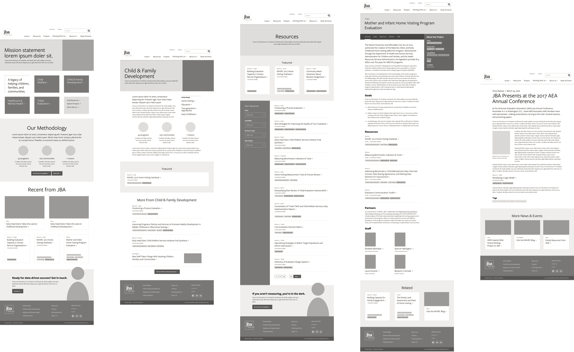
Easy Access to Information
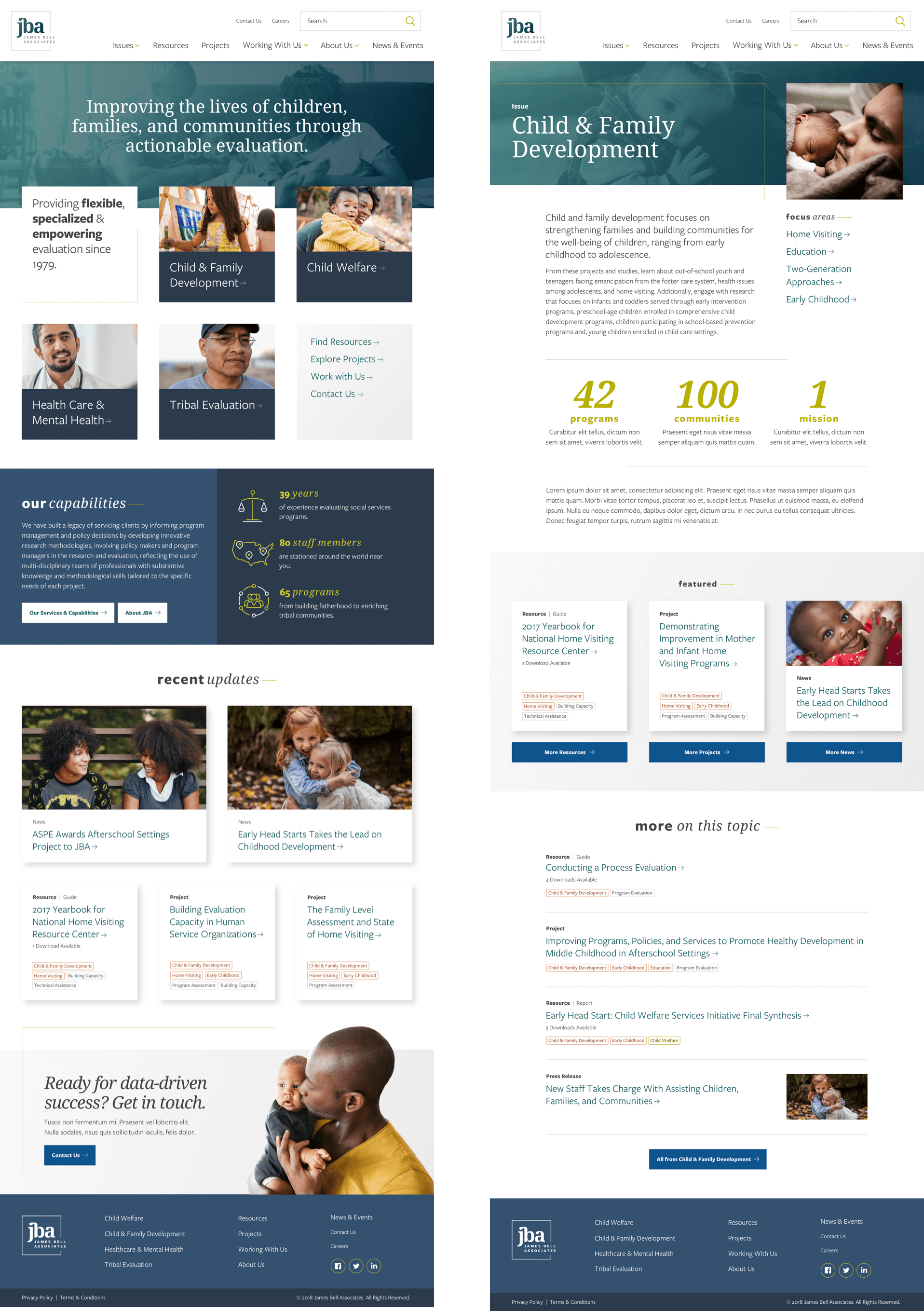
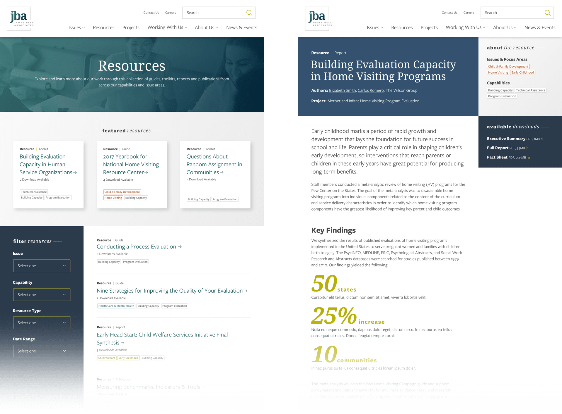
The largest gaps among JBA’s audiences were prospective clients (who had a difficult time grasping the big picture of what JBA offered) and current program officers (who knew JBA had valuable resources to offer, but couldn’t access them easily). With this in mind, I restructured the site to include clear areas up front for JBA to convey their impact for new clients. I organized the resources around core topics that were important to program officers, and designed templates that enabled users to filter down to the information that was most relevant to them.
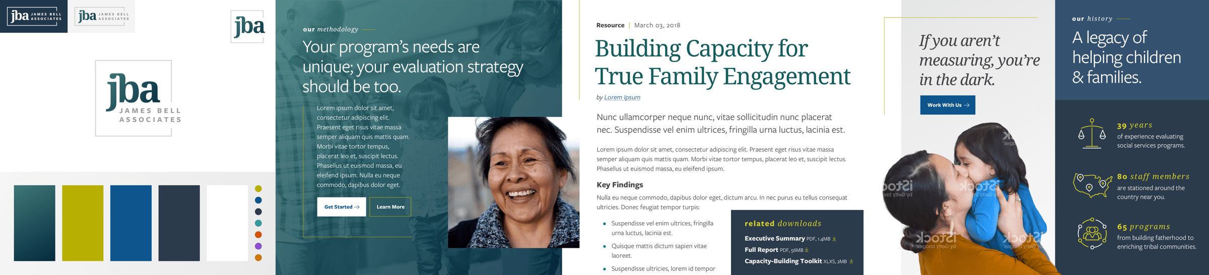
Approachable, Flexible, Practical
I designed the aesthetic of the site to balance JBA’s data-driven practicality with their easy-to-work-with, approachable nature—all while bringing their brand up to modern web standards so their site can last them years into the future.
Designing a System
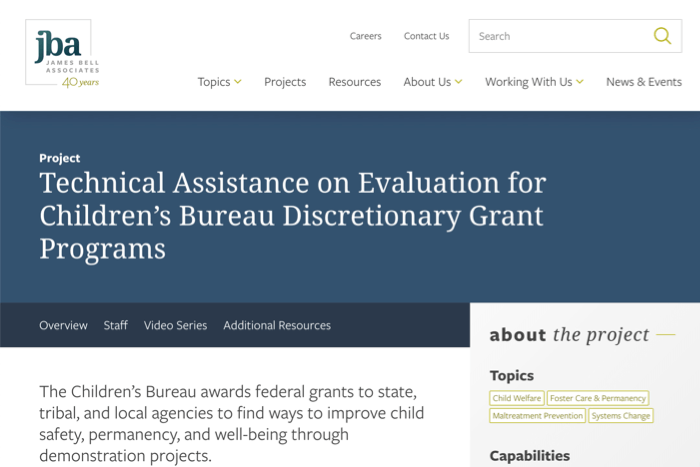
After the branding was established, I applied the visual style to the full suite of flexible page templates.