PAN: The Patient Access Network Foundation
- Process Planning
- Research
- User Experience Design
- Testing
A large website redesign including extensive research, user experience, and testing
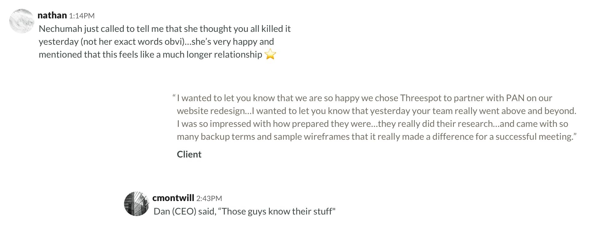
The PAN Foundation serves one primary purpose: to help the underinsured access the medications and treatments that they need. Their current site structure had grown confusing; it was a burden for site editors and led to duplicative but inconsistent content. Newcomers struggled to demystify the complicated world of patient assistance. The site needed simplifying and clarifying—and could better utilize technology to guide patients and medical professionals.
Beginning With the Right Process
We worked closely with the PAN team during the pitch process to develop the best way to organize the project exercises so that we would get the information we needed as creatives and the PAN team would see the deliverables necessary to give feedback on and gain buy-in from their large team.
We defined a structure that was a hybrid of waterfall and agile processes to get the best of both worlds: high-fidelity deliverables to share with key stakeholders, testing opportunities early in the process to get real user feedback, and building a functional MVP to priorities key features before nice-to-have enhancements. I recommended opportunities to add in user testing early—like using treejack tests to audit the IA, surveys to test design directions and UI patterns, and a handful of qualitative interviews to help uncover unexpected gaps and opportunities.
Defining Audience Pathways
Our research began with interviewing internal stakeholders and audience members to discover what people were looking for from PAN’s site and what the common pain points were in achieving their goals. The site had 7 primary audiences which could typically become cumbersome, but we organized them into two major groups with a few key goals per group to keep our strategies focused.
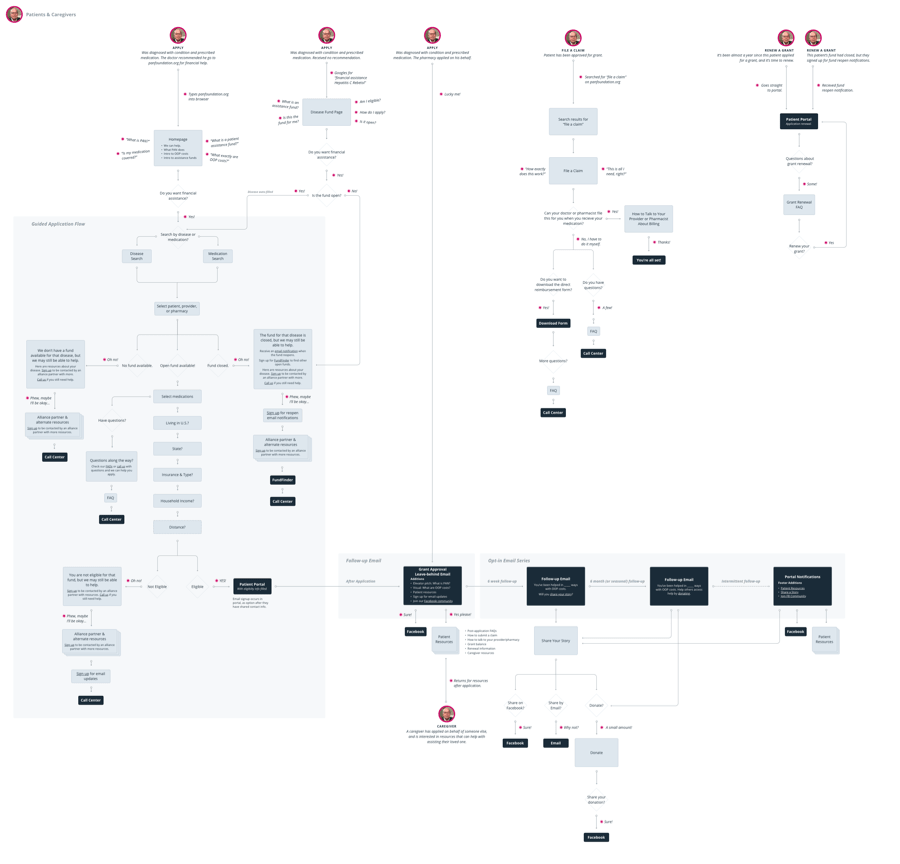
I developed detailed user flows based on our research on the audiences and the patient assistance process. These outlined scenarios for assistance-focused audiences, including patients who need to determine their eligibility for assistance programs and apply to them. I also defined flows for information-seeking audiences including alliance partners and activists who needed access to PAN’s educational resources on out-of-pocket costs.
Revealing the Structure
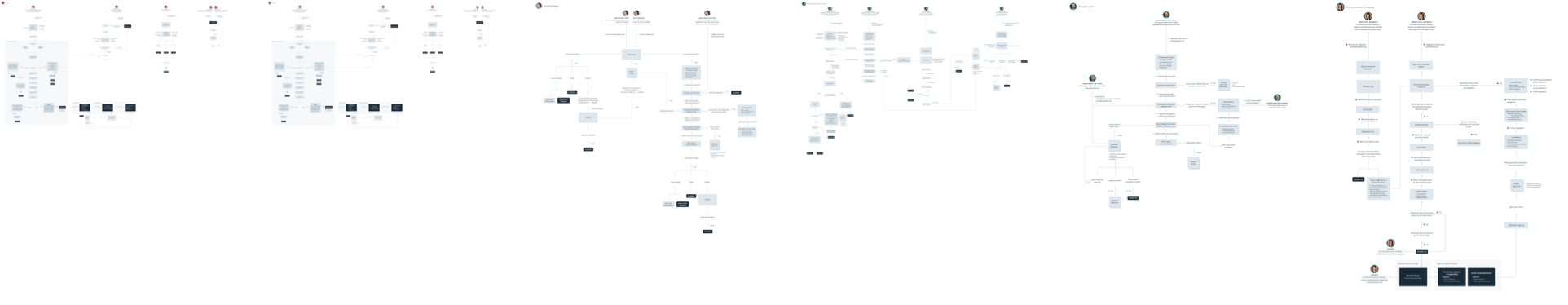
The process of developing detailed user flows revealed common groupings of information. I sorted these groupings and mapped which audiences would interact with each set of information. This was used as an internal tool to inform multiple information architecture (IA) variations to be tested by users.
Testing the Structure
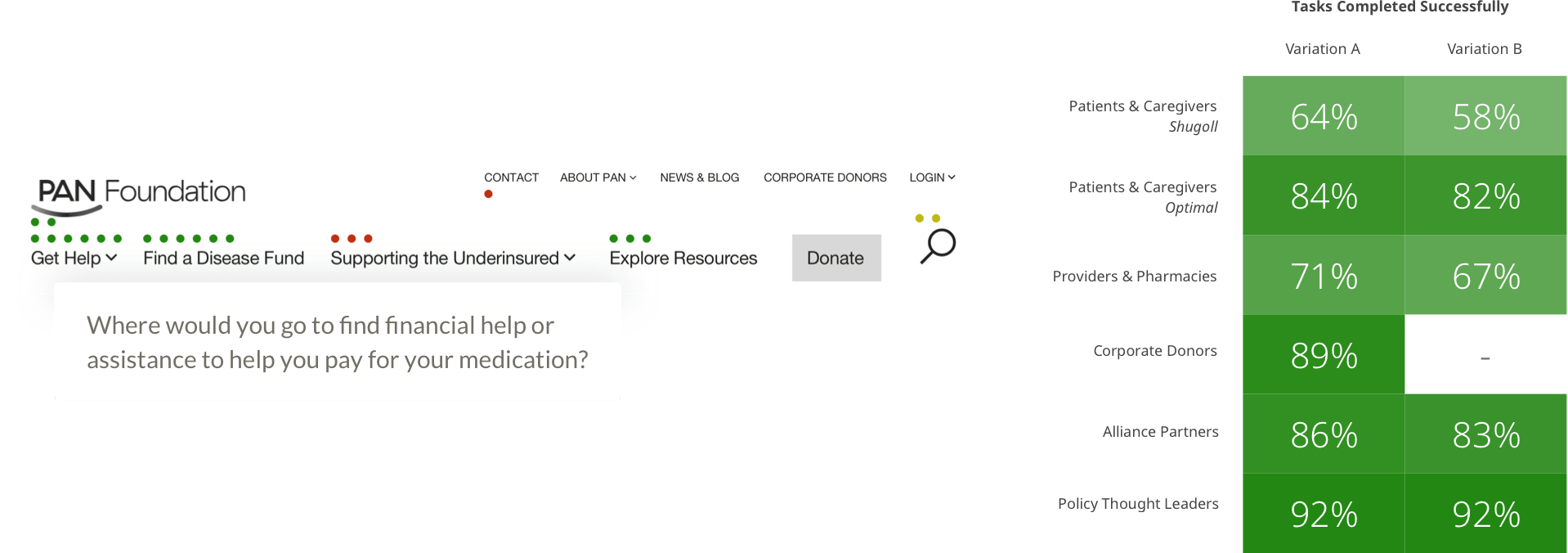
I set up and ran ~50 treejack tests to test the IA variations with audience members. These tests revealed which direction was the most successful overall—but it also highlighted how the different audience groups navigated the structure uniquely.
We used the tests to select the final IA and made small adjustments to the labels to provide more clarity. The tests also highlighted opportunities we could take during content definition. For example, because many users looked for PAN’s key strategies on the About page in the treejack test, we added a promo to those resources on the About page.
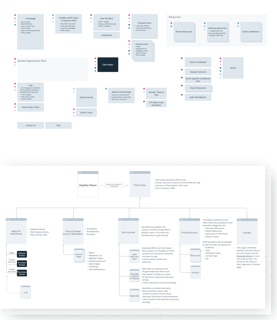
Defining the Pages
Once the site structure was in place, I defined components and pages to achieve our site’s main goals including: guiding new patients through the eligibility and application process without friction, introducing the activated public to the basics of out-of-pocket costs (along with ways to help), and creating a network of disease fund pages that frequent visitors like physicians, pharmacists, and alliance partners could review quickly.
A Guide Flow for Users
New patients had to do a lot of work on the previous site. They needed to learn what an assistance program was, determine if they were eligible, find a fund that applied to their condition, learn if they met the criteria for that fund, and finally re-enter all of that information during the application process.
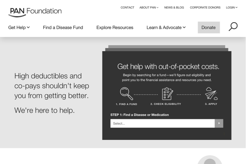
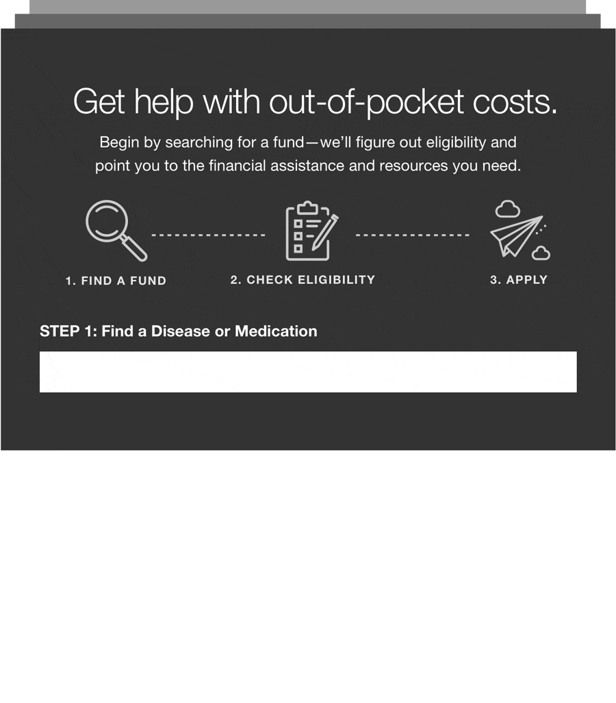
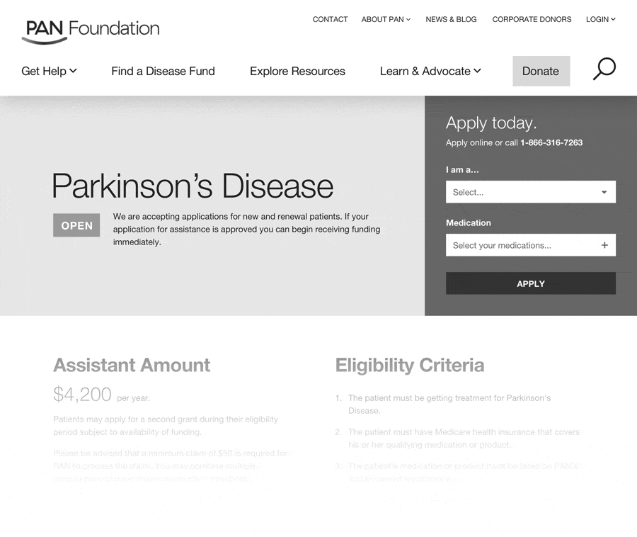
Our goal was to streamline all of that into a single, guided process. Users could find a fund and determine their eligibility all in one location. If they were eligible, the tool inputs all of that information directly into the application for them to complete and send. If they are not eligible, it provides customized options for alternative support.
Organized Disease Funds
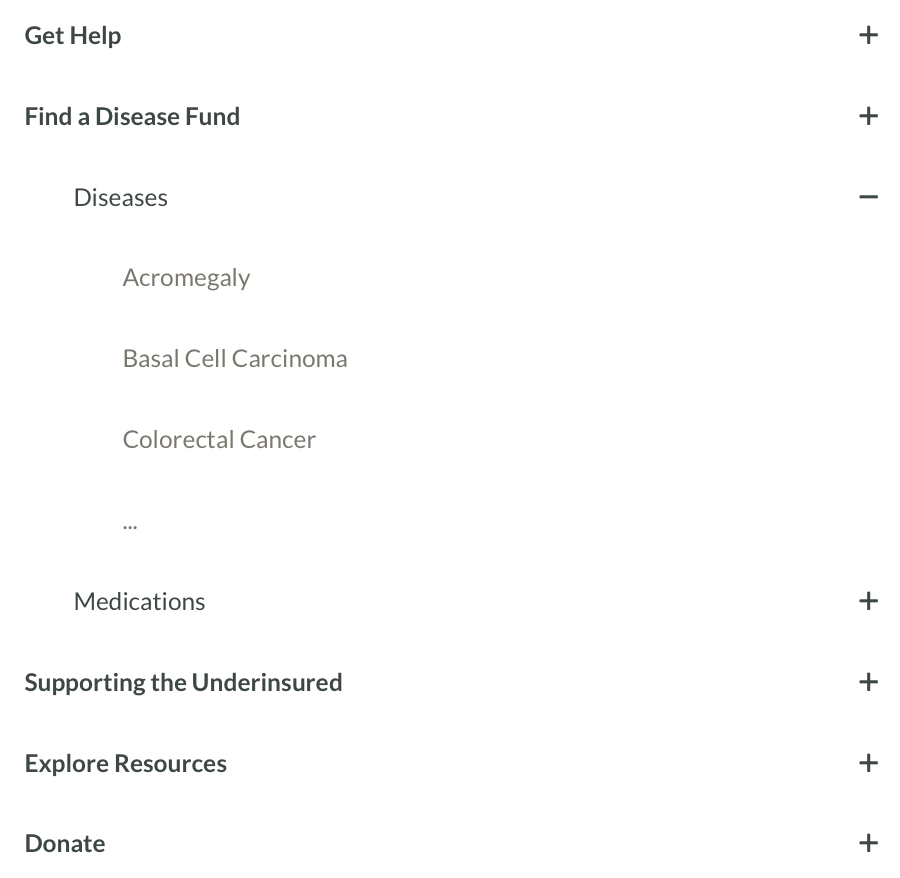
The new site needed to include comprehensive information about all disease funds for heavy users (like physicians, pharmacists, and alliance partners) but be clear and simple enough for new patients. Users could search for disease funds by keyword, or review full lists of funds by disease or medication.
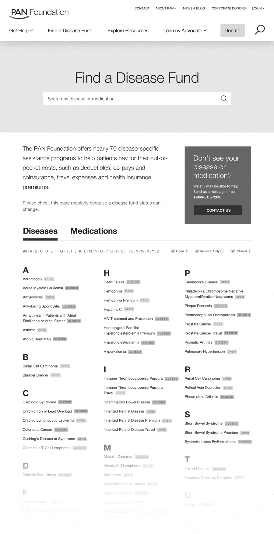
Individual fund pages provided key, scannable information about the fund and eligibility. The top of the page enables users to jump into the application/eligibility flow based on the fund’s current status and availability.
Conveying the Basics of Out-of-pocket Costs
The site needed storytelling components to educate activated members of the public on the basics of out-of-pocket costs and guide them towards ways to get involved. It also needed to lead alliance partners to helpful resources on key strategies to improve healthcare in the long-run. The new site simplified PAN’s message: that PAN helps underinsured patients manage healthcare costs in the short-term while contributing to the reform of healthcare in the future.
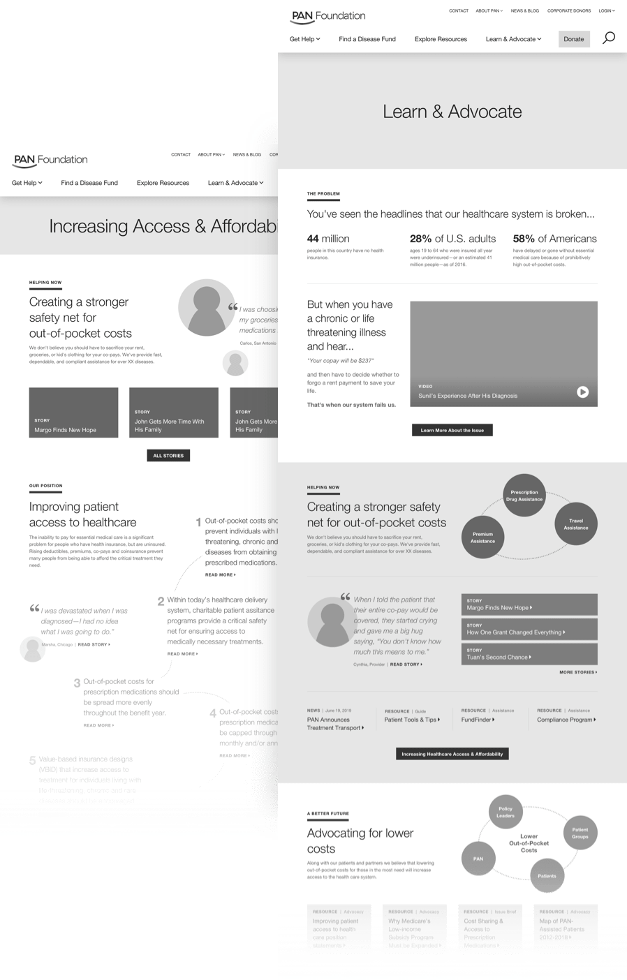
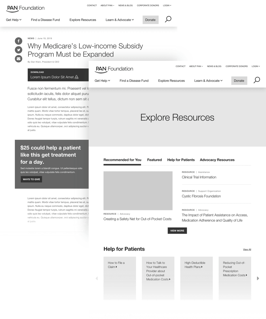
Resources for All Audiences
A resource hub provides helpful information for audiences of all kinds by organizing information into topical collections. These are simple for users to explore, and easy for content editors to manage through tags and taxonomy.
Testing the Aesthetic and UI
After I developed wireframes for the site, designers explore multiple design aesthetics to represent PAN’s brand in the form of page designs. I set up and ran ~50 design surveys to determine which design direction communicated PAN’s desired brand attributes most effectively. The tests included a handful of usability tasks to ensure that the structure, layout, and design were working together successfully for a functional product. I also conducted a few phone-interview design tests with users to obtain unpredictable qualitative feedback.

Bringing it All Together
The testing revealed that most users related the first design direction to warmth, support, and a human touch. However, they found the second design direction to be more clear and easy to navigate. In response, the designers took the most effective aspects of each direction to develop a cohesive final design solution.
You can view the live website here.
About the Project
This project was created during my time at Threespot.
Client
Project Team
Process Planning, Research, User Flows, UX Design, Wireframes, & Testing—Meryl Pritchett
Creative Direction & Process Planning—Chris Montwill
IA, & UX Support—Olivia Stetler
Visual Design—Jamielyn Smith & Megan Lewis-Smith
Development—Daniel Boggs
Project Management—Nathan Fields