Pew Charitable Trusts
- Research
- Strategy
- UX
- Wireframes
- Data Visualization
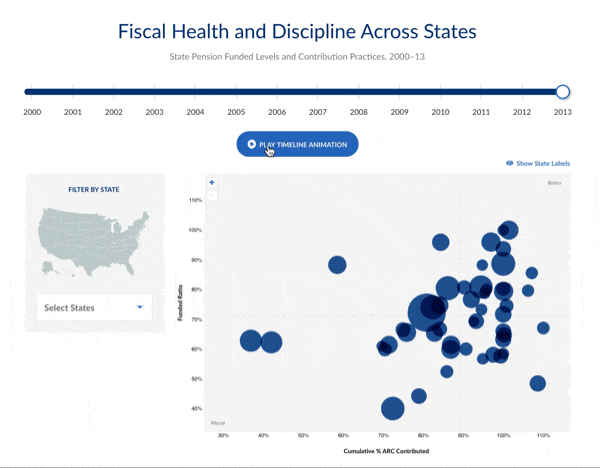
A data visualization microsite that communicates the state of public pensions at a national and state level
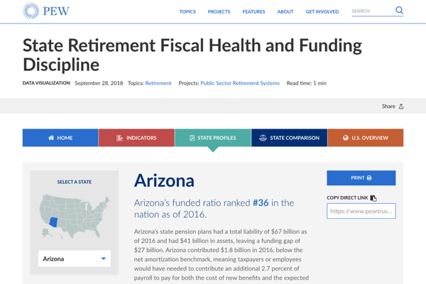
Pew Charitable Trusts challenges us with creating a microsite that could clarify the complex and evolving picture of public pensions to policymakers and their staff. The tool is used to help inform policy decisions by highlighting the performance of each state and their change over time.
Learning the Lingo
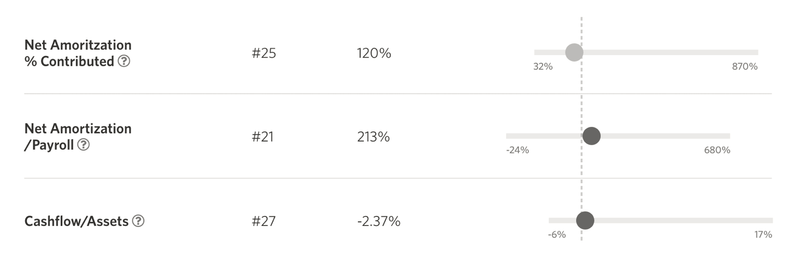
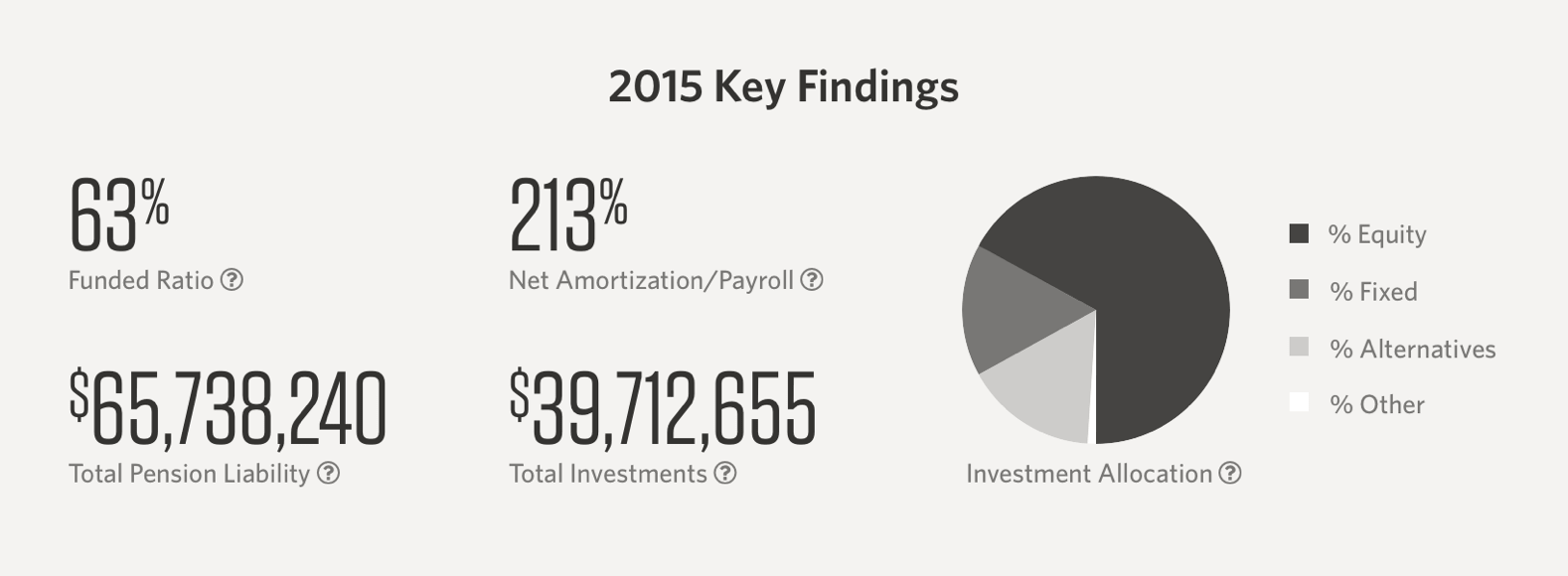
The first step in the process was familiarizing ourselves with public pensions—reaching an understanding of concepts from Net Amortization to Investment Allocation—so that we could understand the data enough to communicate it effectively.
Collaborative Definition
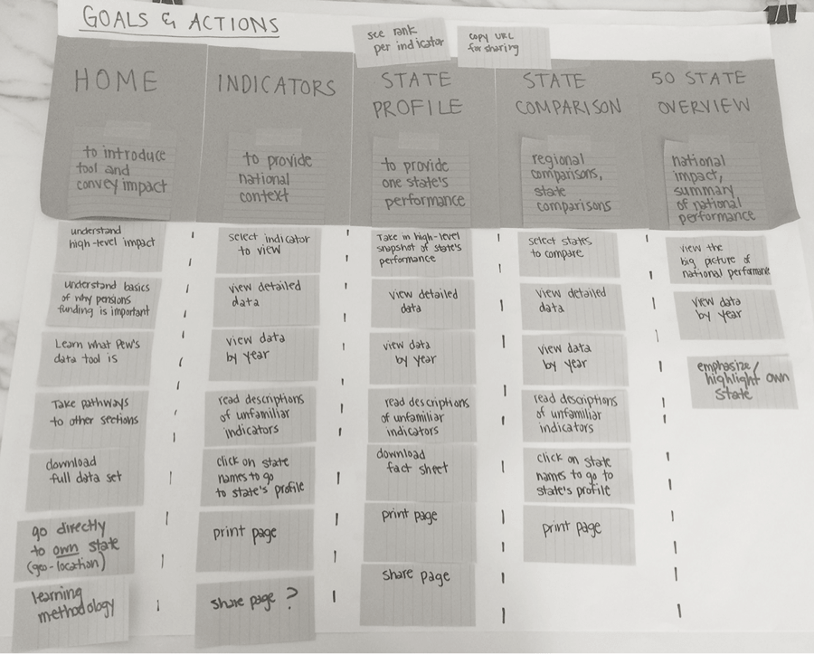
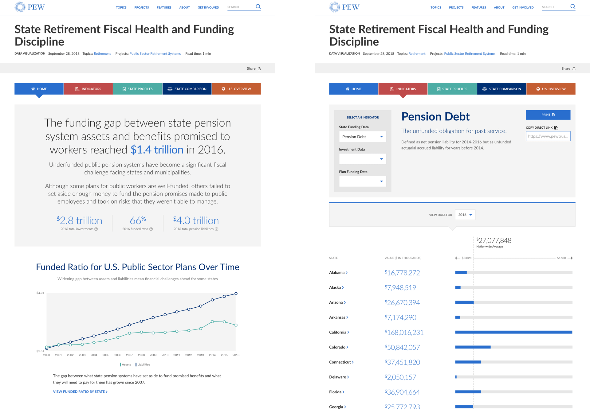
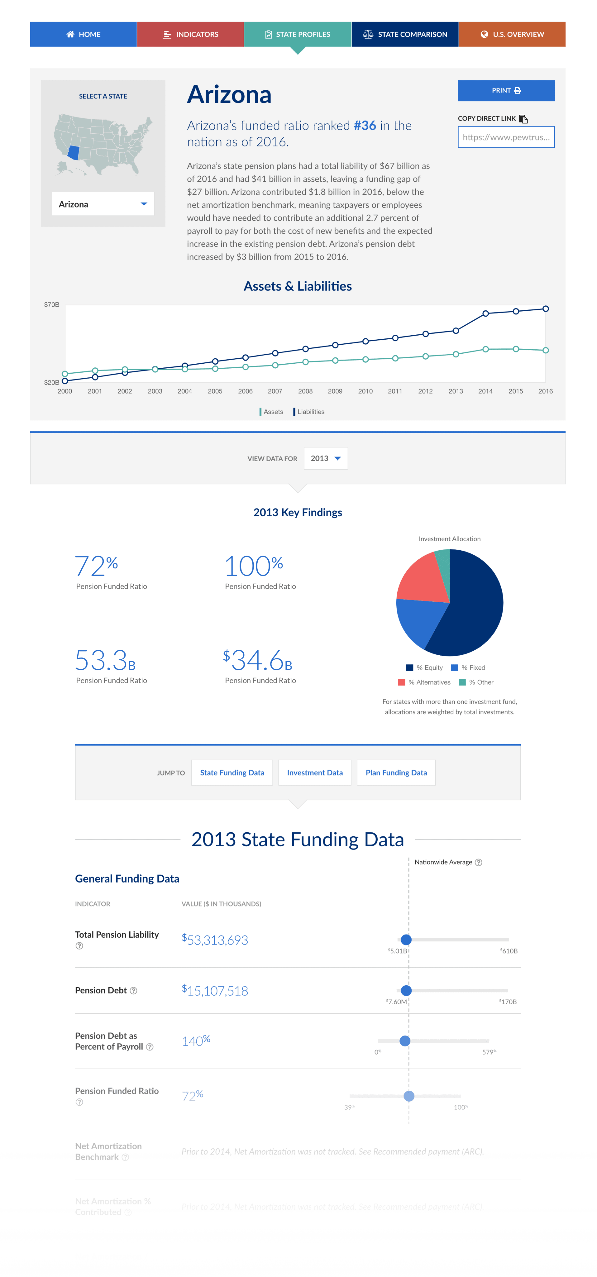
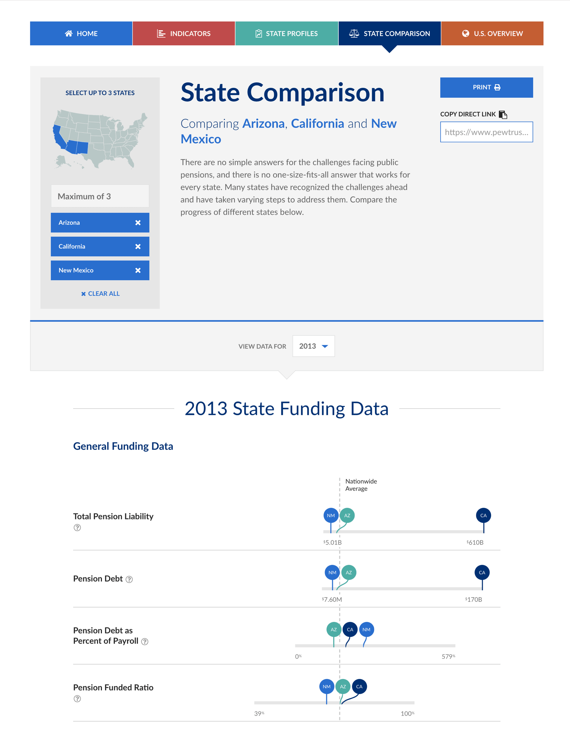
We worked closely with the team of pensions experts at Pew to figure out the best way to structure the collections of information to tell a clear story to policymakers. From there, we determined the best combinations of charts and graphs to convey the data with clarity and accuracy.
High-fidelity for Details in the Data
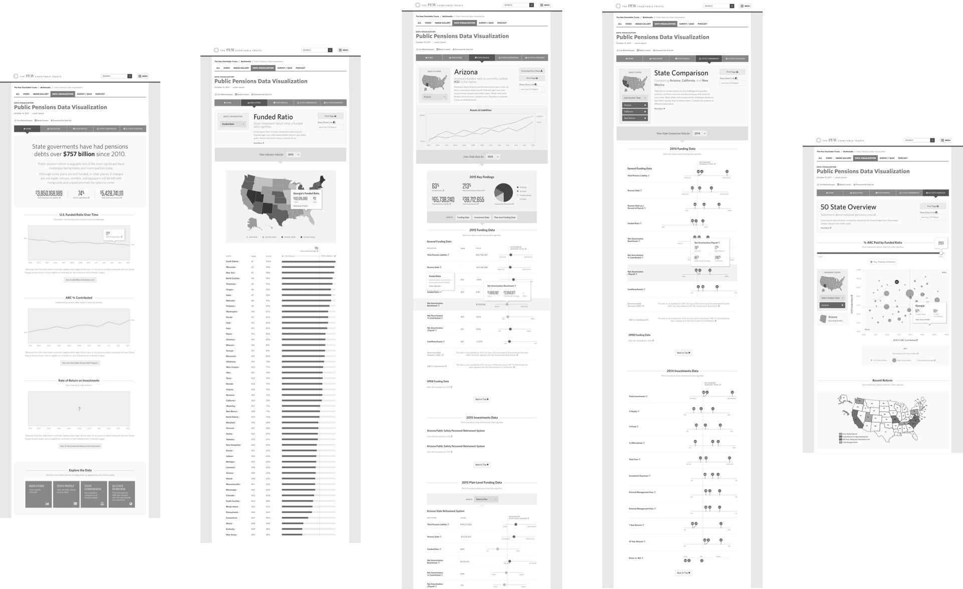
I produced high-fidelity wireframes so that we could make detailed decisions about how to display the data without worrying about style.

Designed for Clarity
Then I applied the aesthetic of Pew Charitable Trusts’ main website to the microsite.

You can view the full version of the public pensions data visualizations here.
About the Project
This project was created during my time at Threespot.
Client
Project Team
Research, Strategy, User Experience, UI Design—Meryl Pritchett
Creative Direction—Sid Barcelona
Development—Ted Whitehead
Project Management—Lizzy Cederberg